
Filling the gaps of cybersecurity and IT
Creating IT features in cybersecurity platform to close the gap between IT and SOC.
Figma / Interaction Design
Projects or Project?
There are technically 4 projects here. Each solves a different problem, and they aren’t really related. They only exist as separate projects because engineering split them up to look busy in Jira and Confluence.
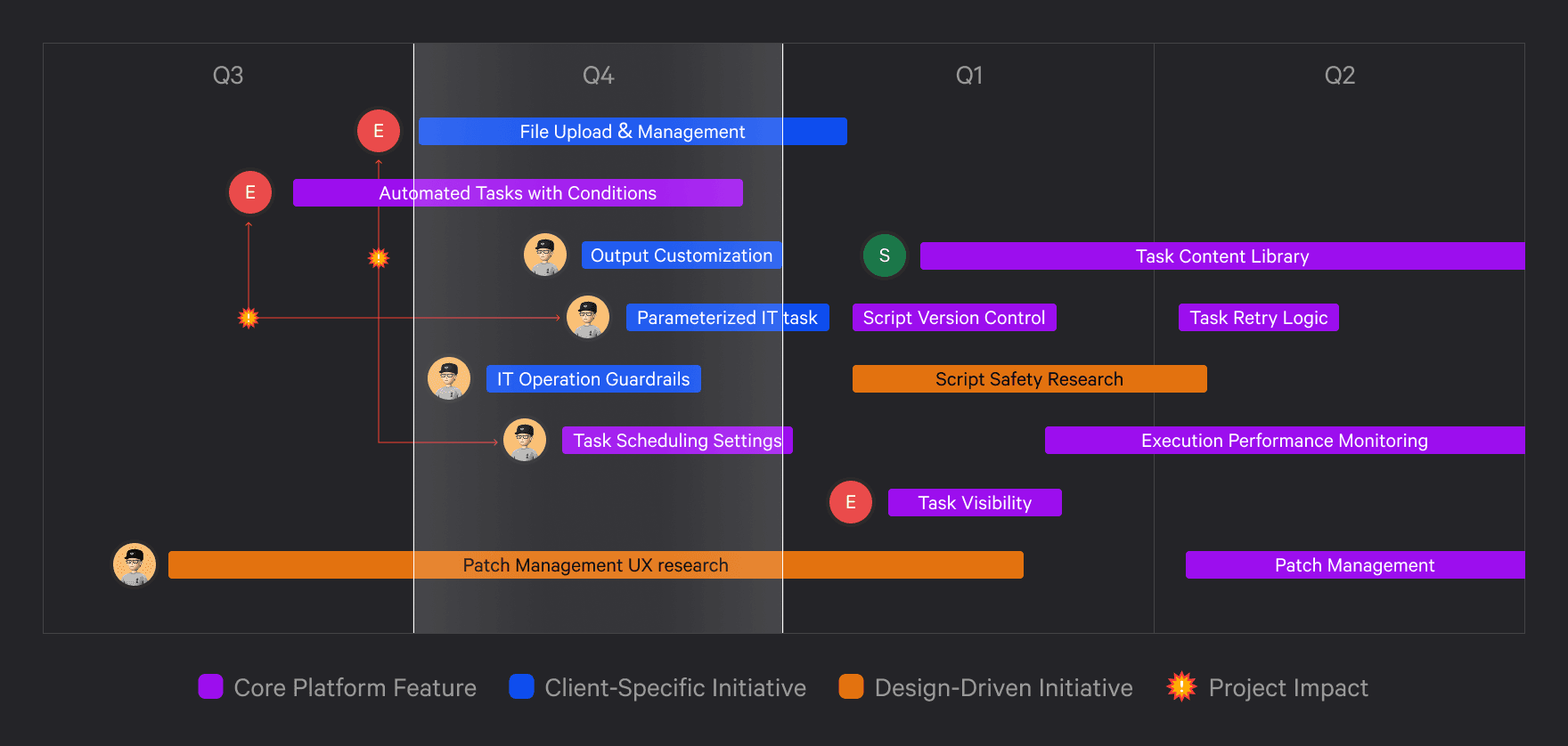
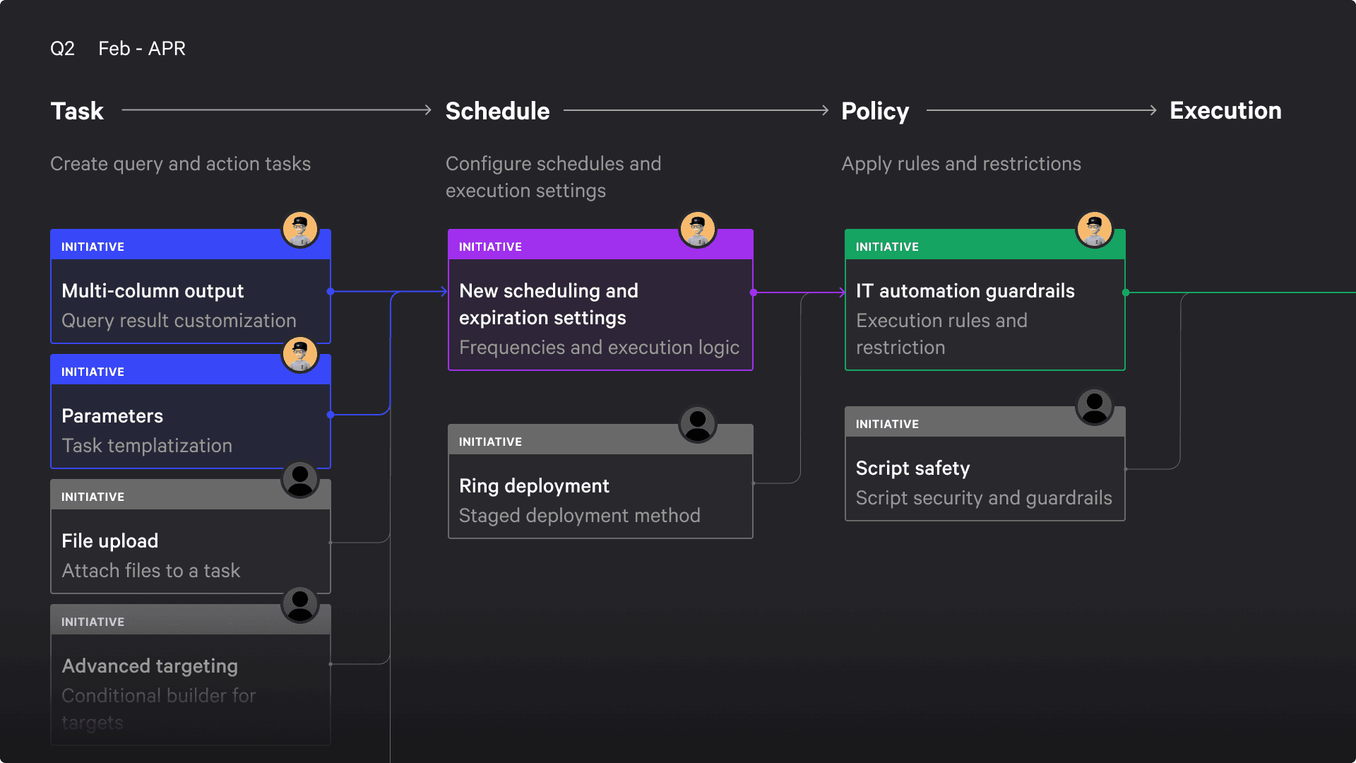
To me, this is just one medium-sized project.
Context
The “one platform” idea is what made many SaaS companies successful. Same story here.
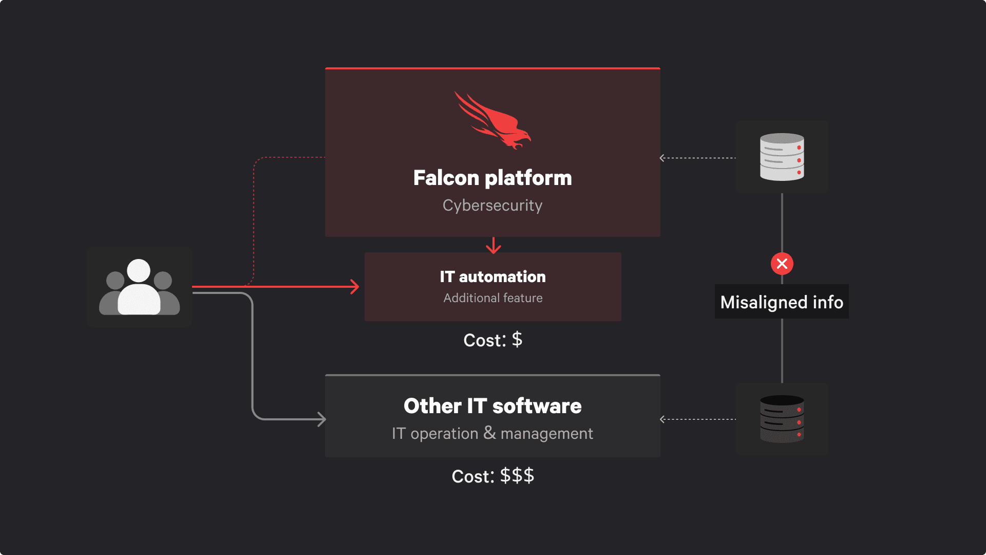
There’s a gap between IT teams running operations in IT tools, and security teams assessing vulnerabilities across fleets of devices. Two platforms, two teams, constant switching. It’s inefficient, annoying, and data doesn’t always align. So we built basic IT features into the platform, letting customers already using the security product start moving their IT operations into it.
My role and my situation
I was the sole designer on these projects, alongside another designer working on adjacent areas. As a new team member, my domain knowledge was limited, and I often couldn’t defend design decisions when engineering leaned on backend concerns to challenge them.
IF YOU ASK:
Better projects? No.
In 3 years at CrowdStrike, I wasn’t assigned to exciting work. I got moved between teams, picking up projects no one really cared about. Classic pre-layoff marginalization.
- I’m not going to make up a project. Fake stories don’t hold up.
- I’m not going to sugar-coat this case study. It wasn’t great.
Looking for a real good case study? You can close this window and move on to your next candidate.
Research focus group
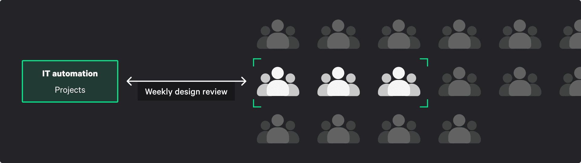
One good thing: we had a client acting as a weekly focus group. A Fortune 500 IT team worked closely with us and walked us through their workflows using Tanium.
Why this matters
The real value: combining vulnerability data with IT operations in one place. That’s the differentiator. But we’re not replacing major IT tools. The strategy is to replace key workflows, not the entire system. Enough business, here’s what I did
The Current IT Workflows
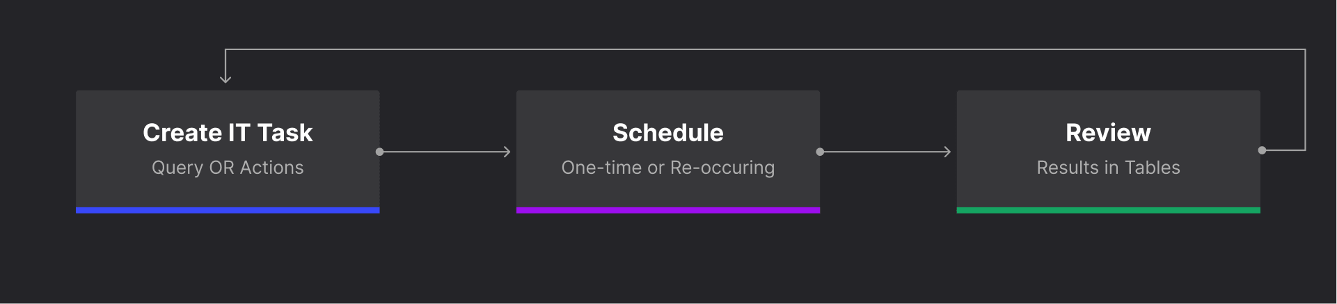
Simple:
- Create a task to check or act on devices
- Schedule it
- Review results
Task 1: Fixing scheduling
Fix the scheduling issues.
Honestly, a PM could’ve done this. Having a designer here felt like process theater. I skipped research, went straight to UI, and prepared justification. Typical big company SOP, slow everything down so everyone looks busy.
Root cause
Customers were confused by scheduling options. Some didn’t trust using them at all.
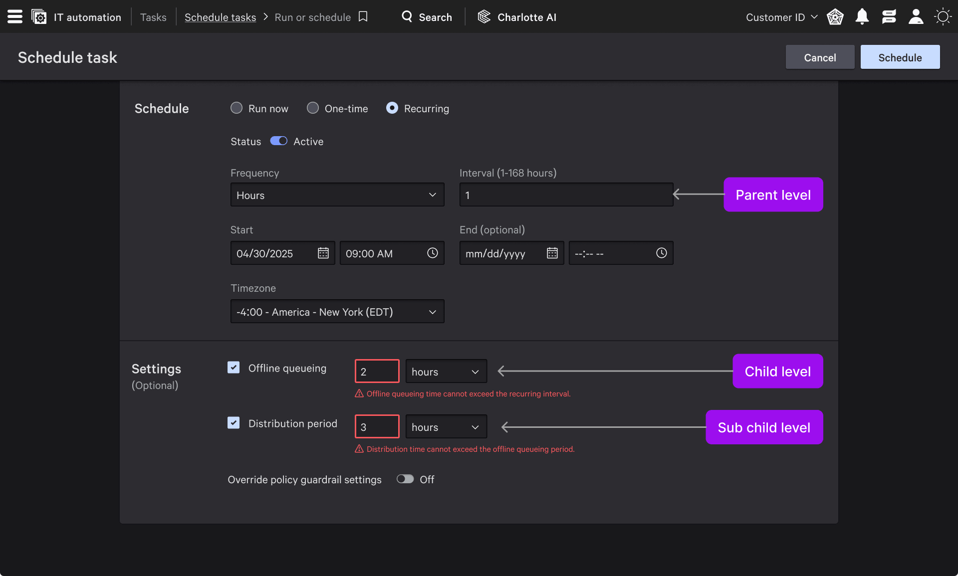
The problem
Multiple input fields with strict dependencies. Entering values often triggered errors because inputs had to follow hidden rules.
This is why I said a PM could do it. The fix was obvious: change the UI type and clarify labels.
Scope vs. reality
I thought this was a one-day fix. It turned into a one-month cycle with weekly syncs.
Design proposal
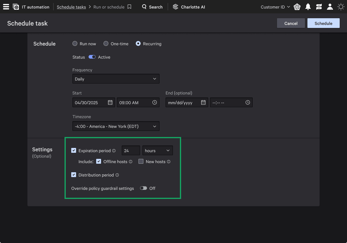
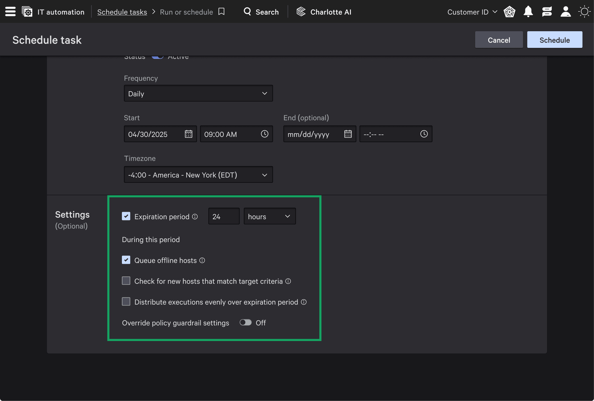
Replaced inputs with checkboxes and clarified labels. Made two mock options for stakeholders.
Engineering pushback
They needed to “evaluate backend impact and data parsing.”
Basically: “This looks simple, but could take months.”
As a non-technical person hearing that, all I could do was agree to another meeting next week.
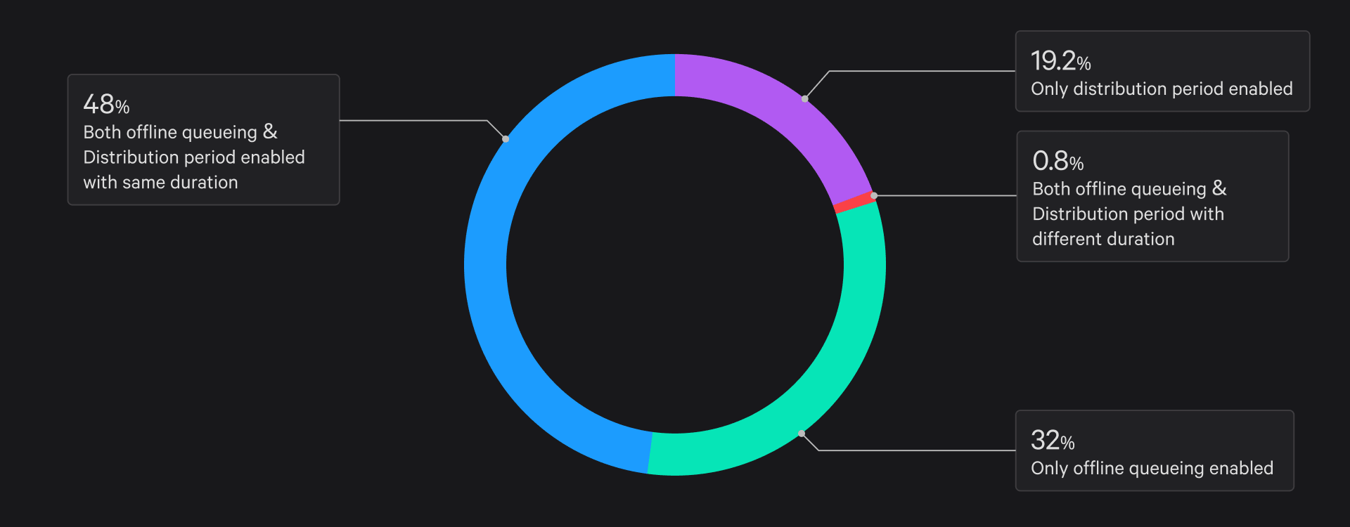
Pre-migration evaluation and assessment
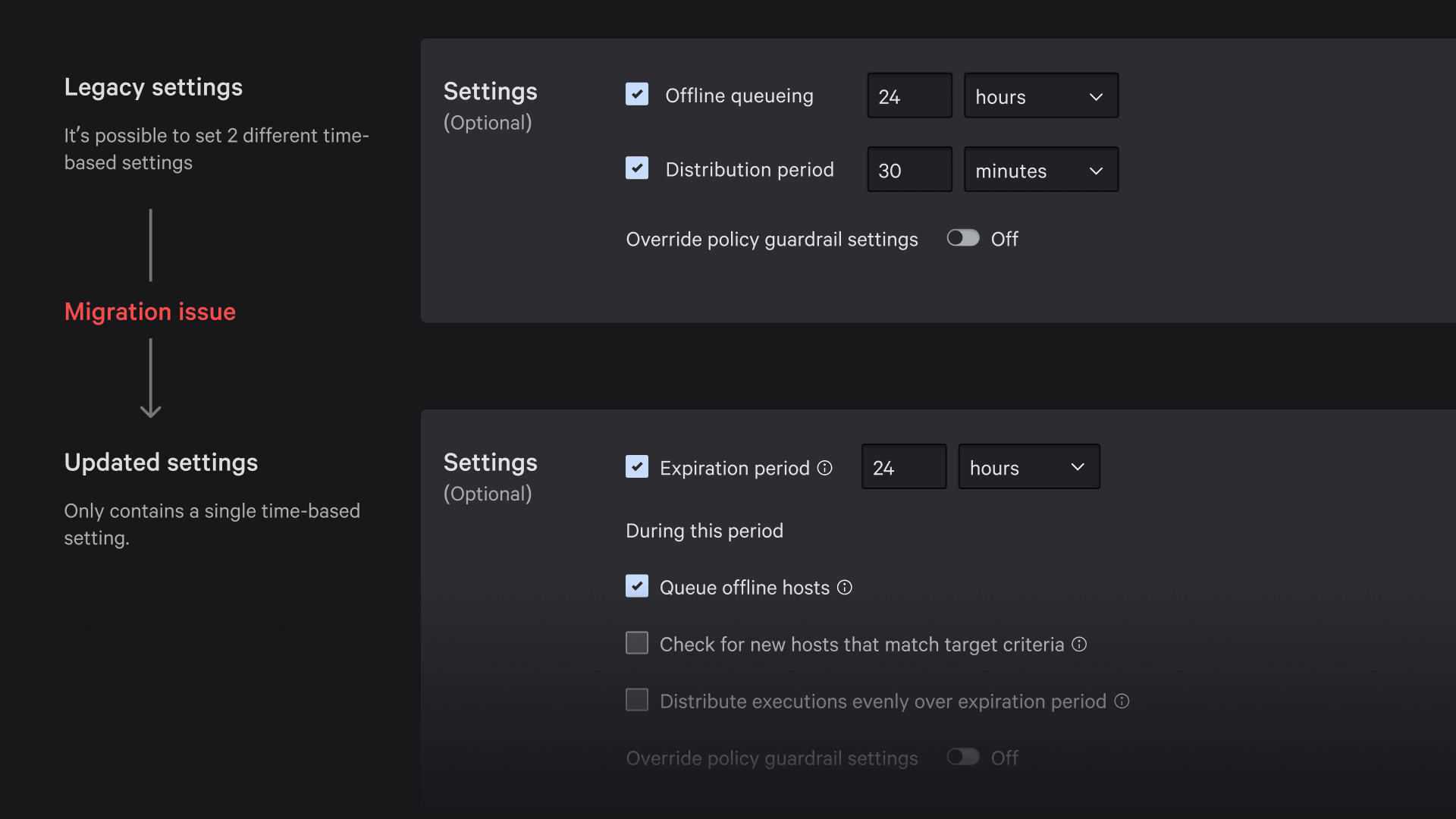
Migration from legacy settings to new settings
Result
We shipped the original design I proposed. It still took ~5 weeks to finalize wording and get backend approval for a checkbox change.
Task 2: Customizable output
At first, I had no idea what this project even was. New team, new domain, unclear requirements. I had to ask both customers and teammates just to understand the ask.
Context
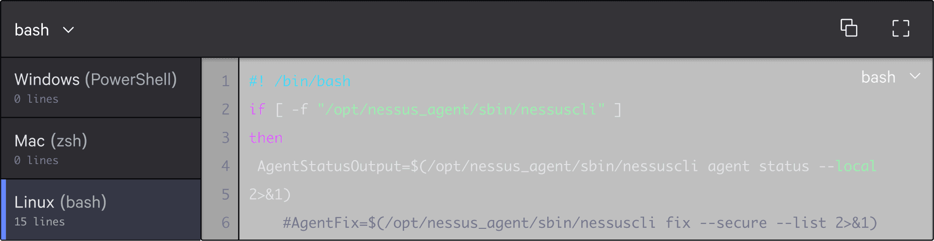
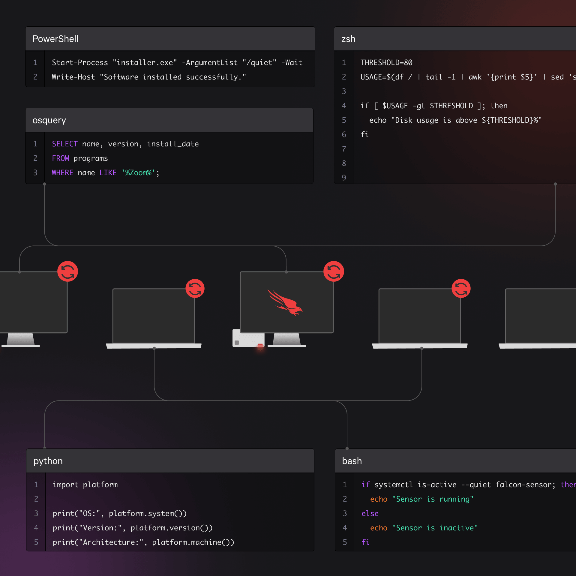
IT teams query data from devices (physical and virtual), often using PowerShell, Zsh, or Bash. Sounds technical, but the result is simple: messy, unstructured output.
Problem
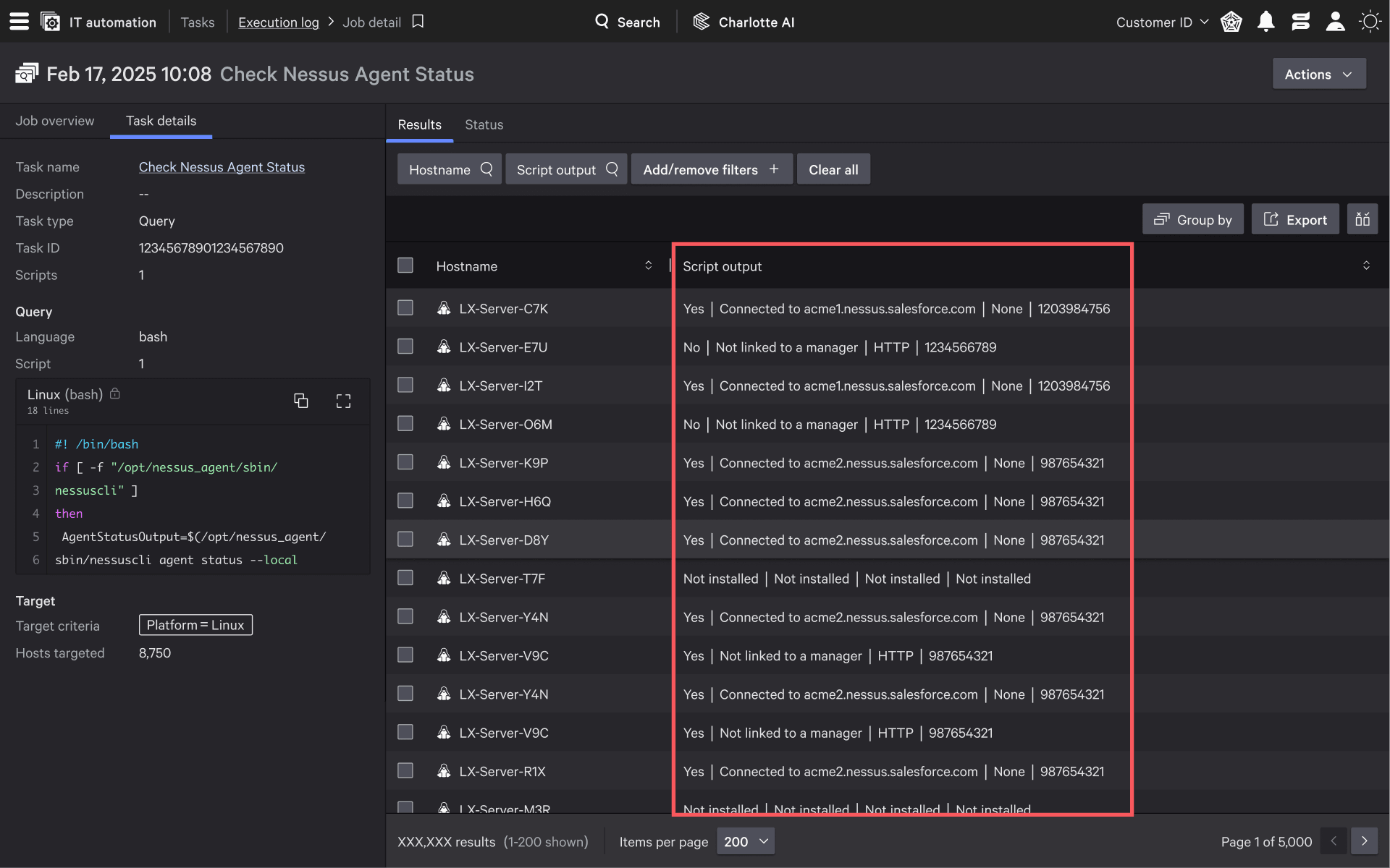
Data comes back split by " | " and dumped into a single cell. Hard to read, hard to use.
Design
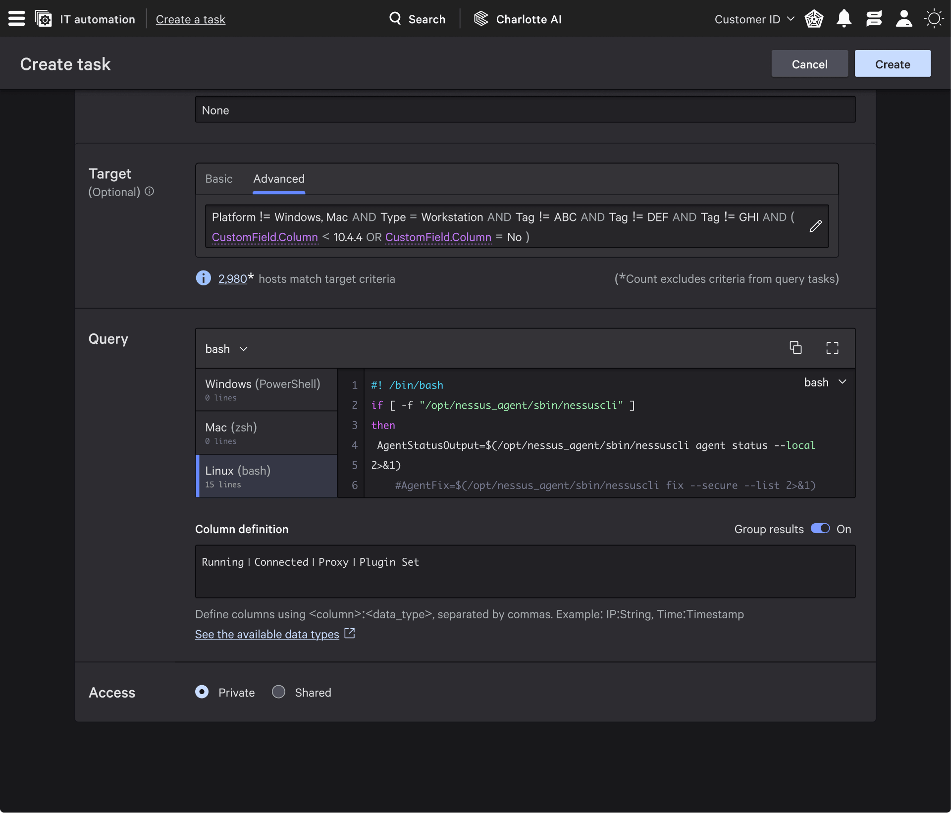
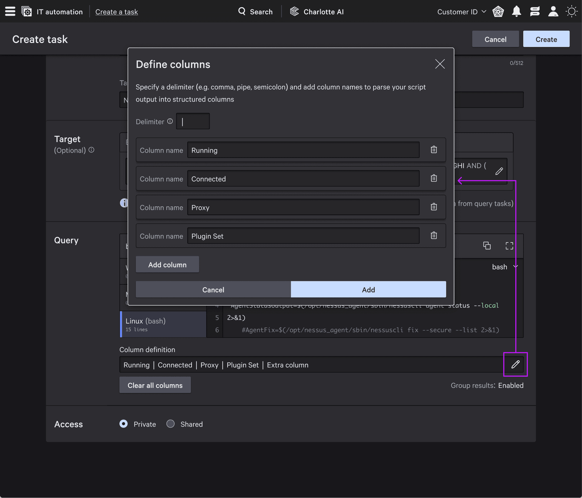
Create a UI to let users define how to split the data and name each column. This was straightforward. I identified where it should live and designed it quickly.
Engineering pushback
They were worried that allowing unlimited columns would overload the backend. They wanted to cap it at 5 columns.
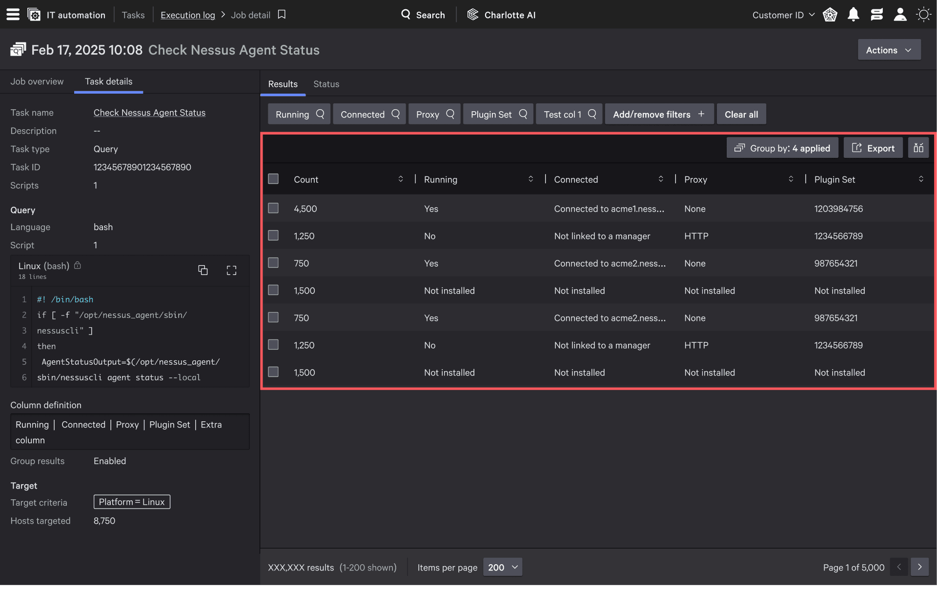
Backend limitations are the strongest weapon for forcing design changes.
Result
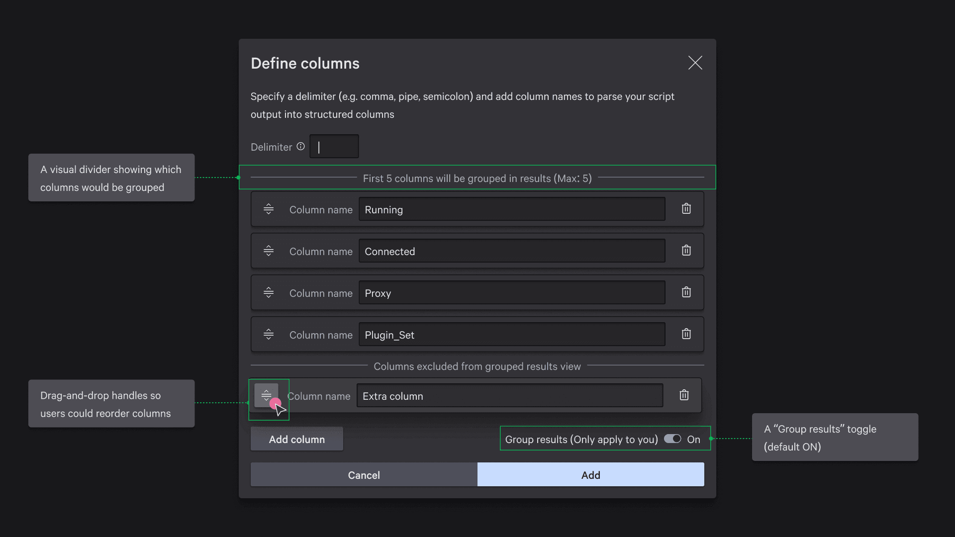
I pushed back but lost. Engineering provided long documentation about system risk. I compromised. Sad.
Task 3: Adding variables to tasks
Context
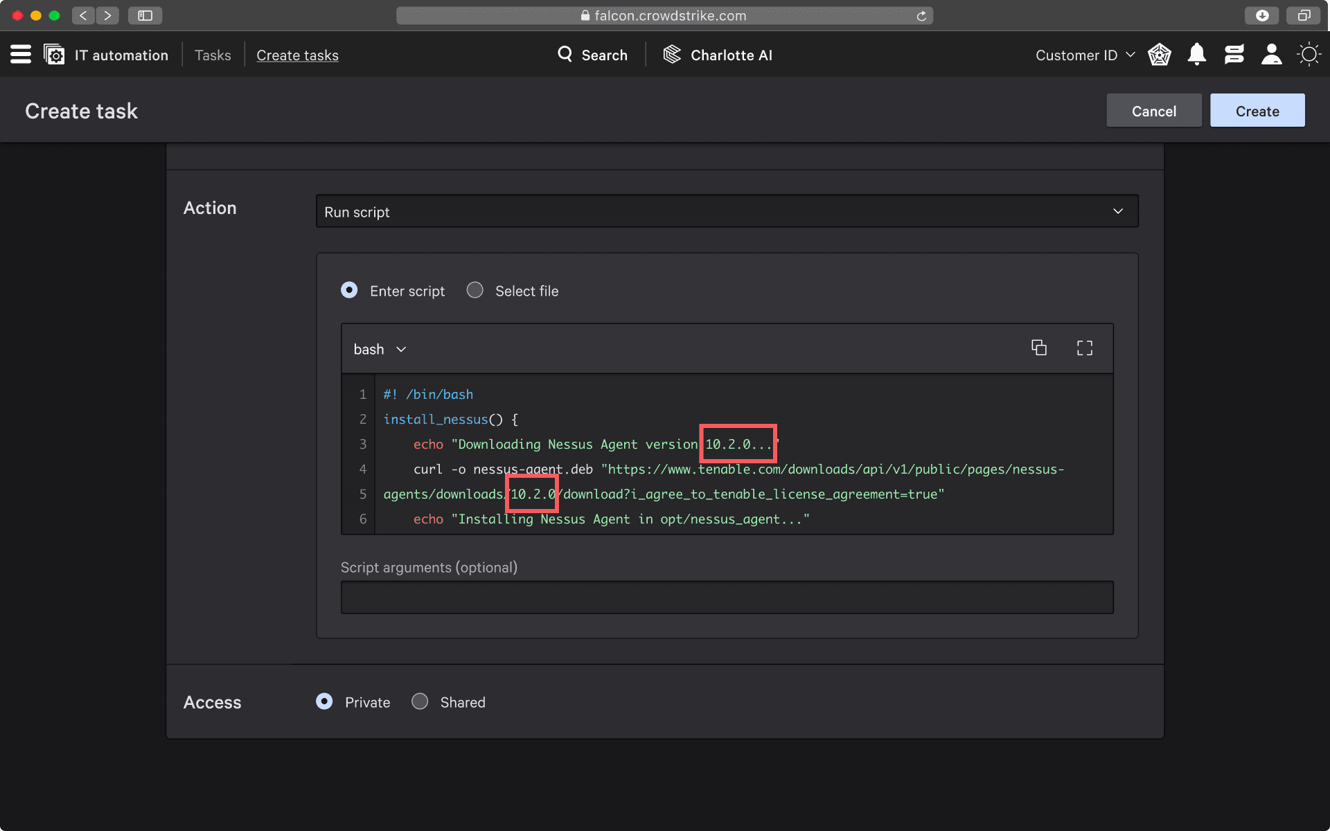
This one actually felt like a real project. The client used variables (parameters) in another platform to make scripts reusable and safer.
Research
I used AI, Google, and competitor tools to understand how variables work. That gave me enough clarity to design properly.
Placement debate
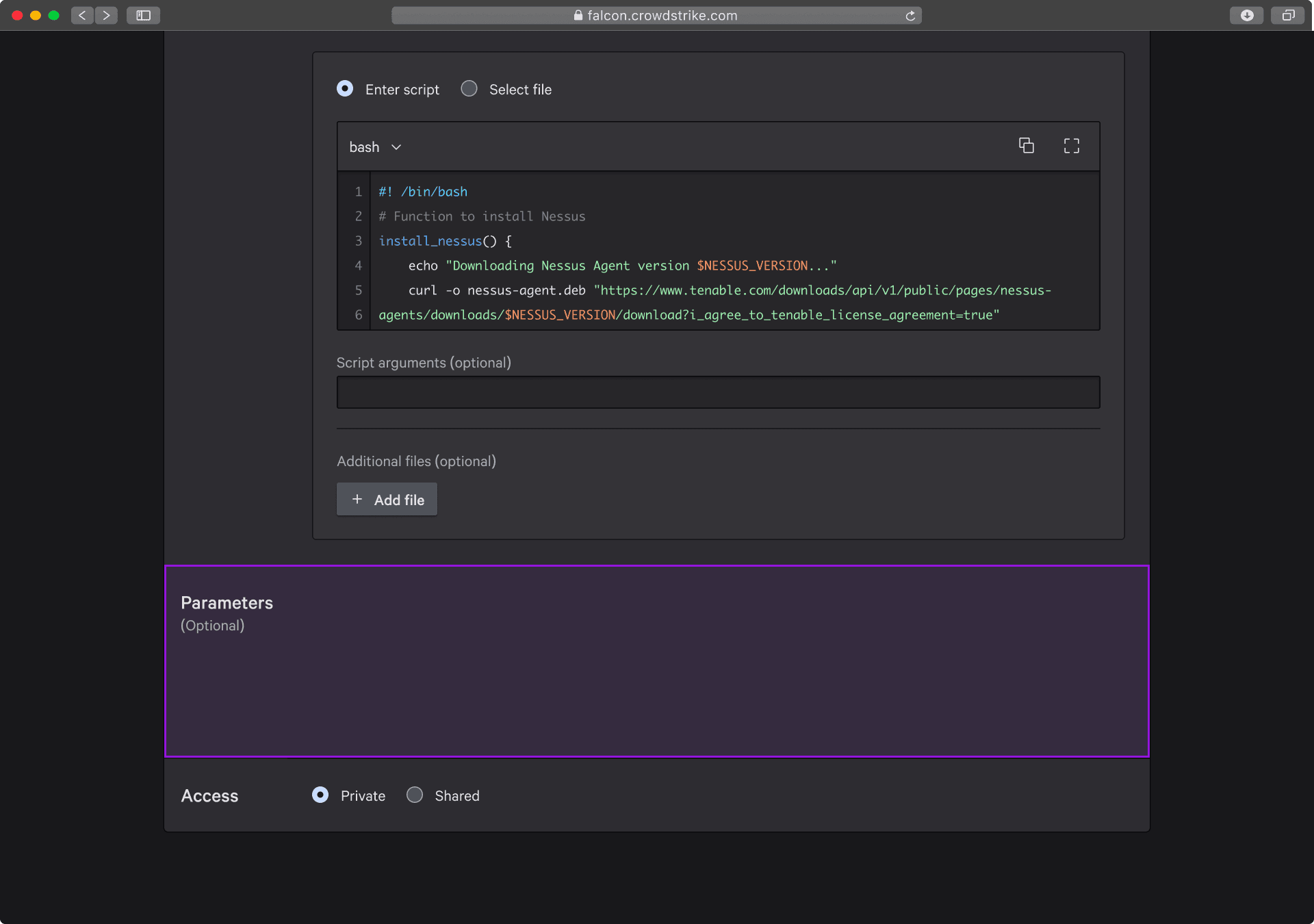
Should variables appear before or after the code? I argued after. It’s optional, and placing it before makes it feel required.
Design
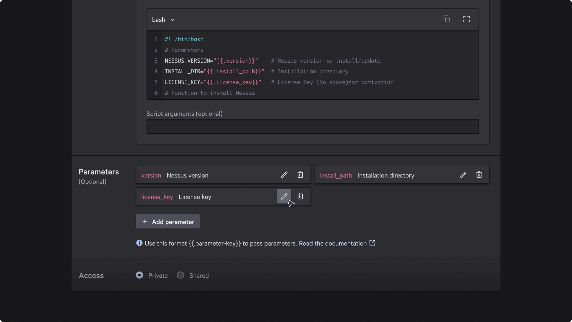
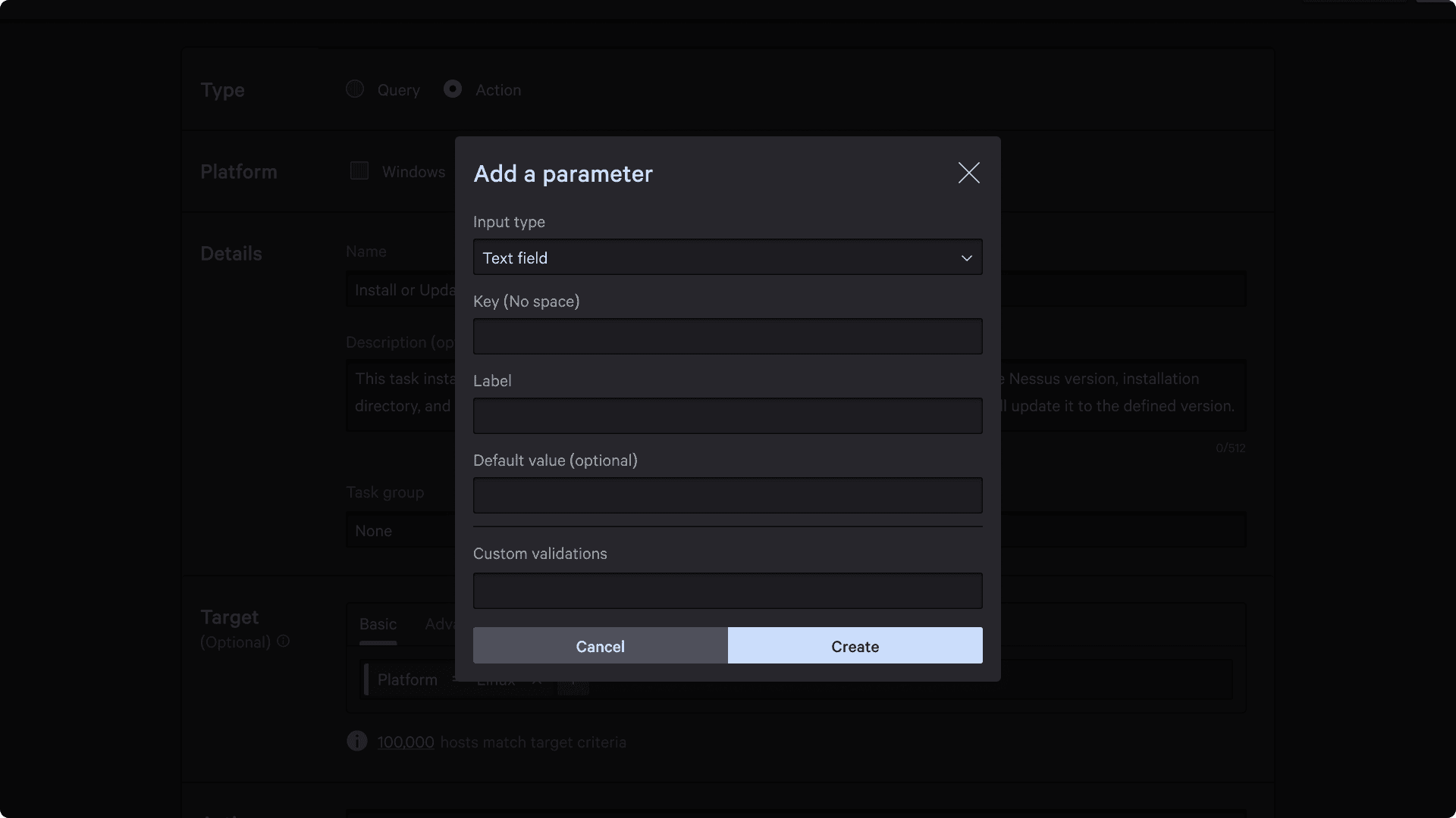
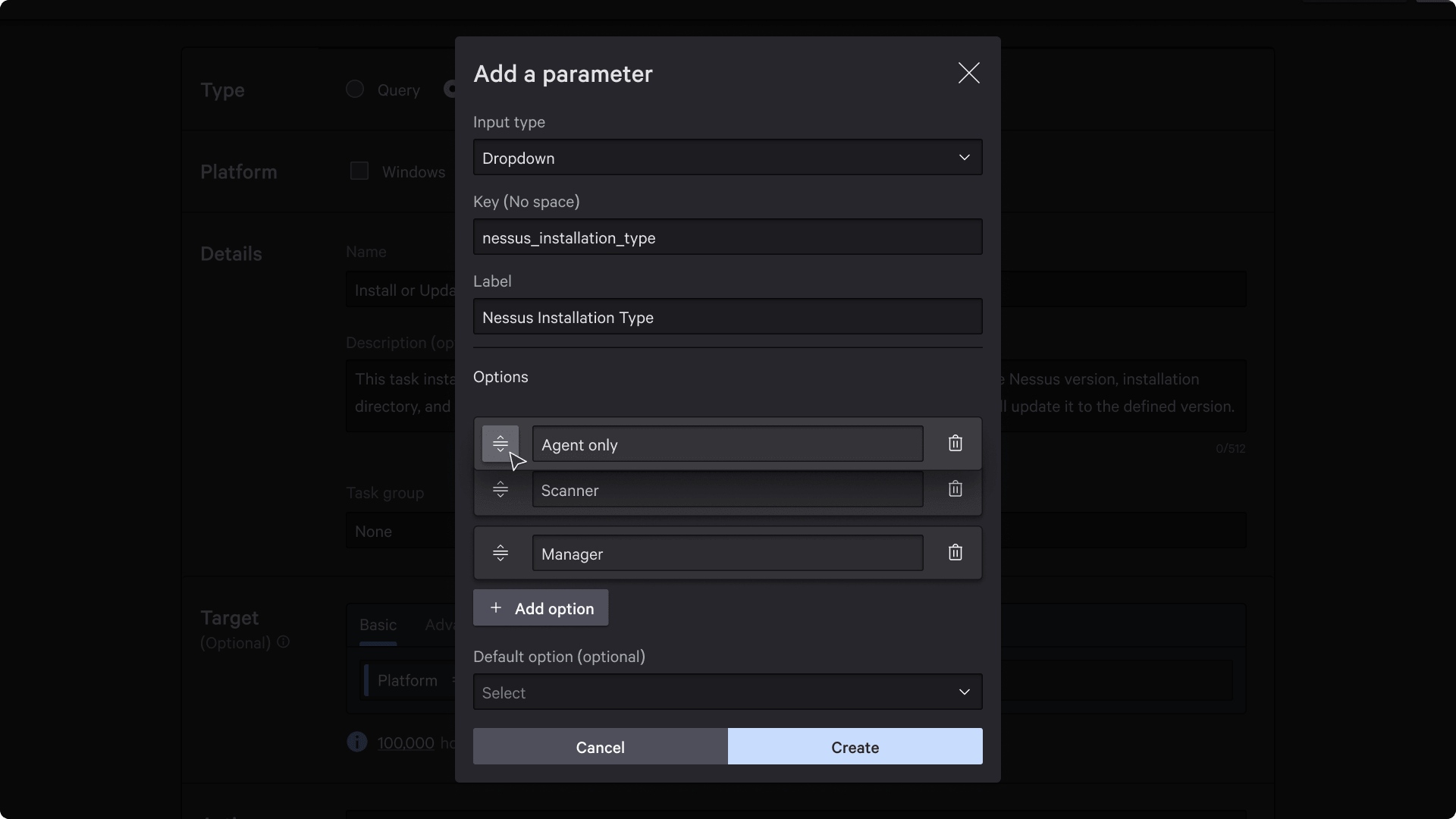
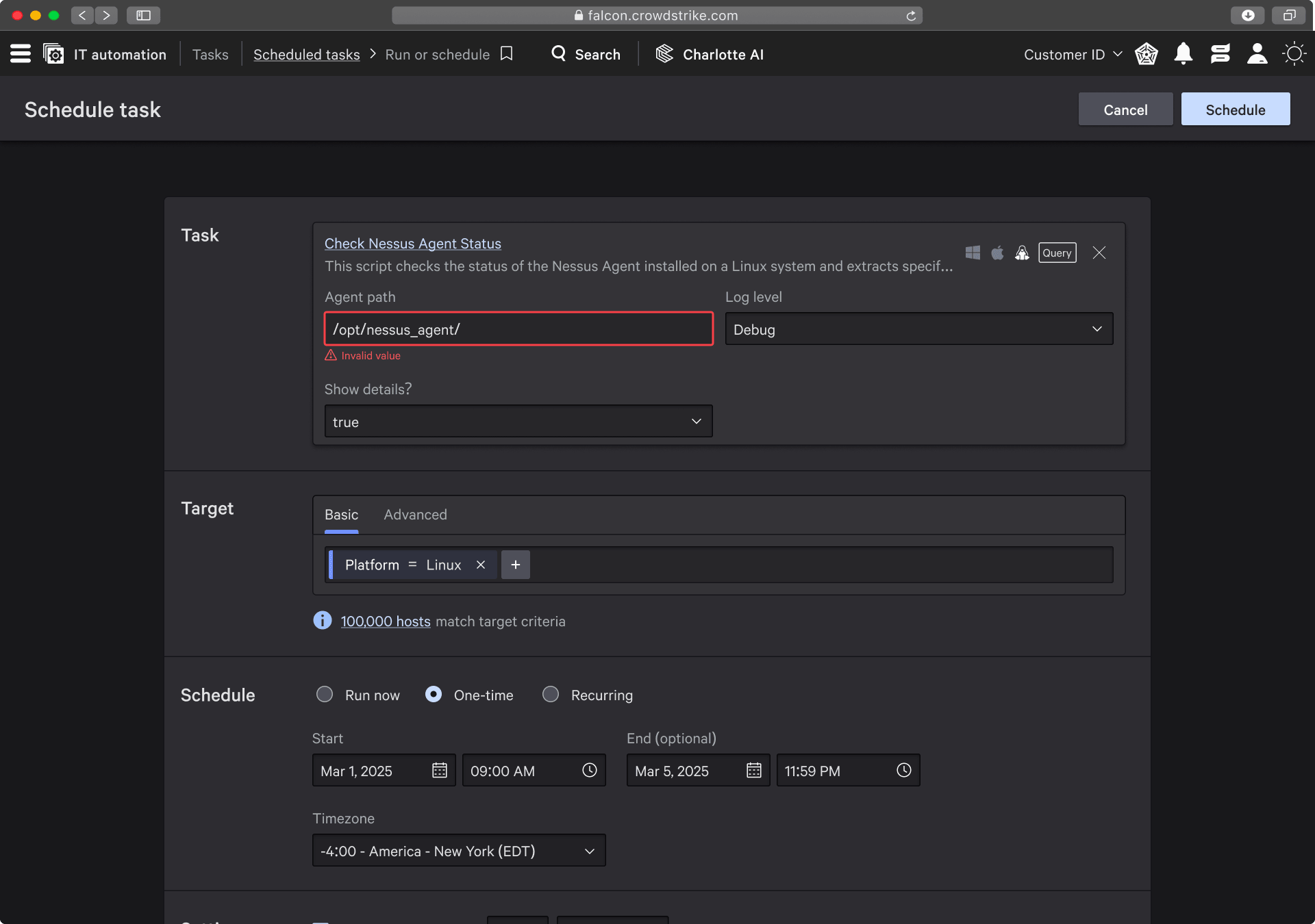
Worked with two engineers who were reasonable, less pushback, more helpful reminders. Felt like a normal team for once.
Result
Customer reviewed it, liked it, no issues.
Task 4: Configuration controls
Another “PM could do this” project. But sure, trust the process.
I focused on:
- Researching MacOS system behavior
- Arguing with engineers about input vs dropdown vs radio buttons
Context
The client wanted safeguards to prevent excessive IT tasks from overloading machines.
The right place: platform-level policy configuration.
Why does this one client have so much influence?
Because they’re the largest CRM company in the world. Big contract potential. Money talks.
Problem
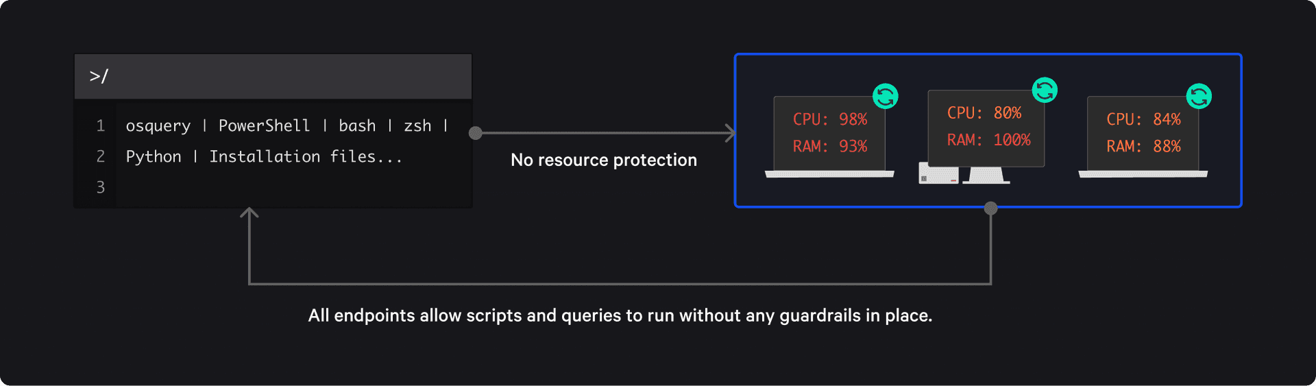
No way for admins to set limits on task execution and resource usage.
Research
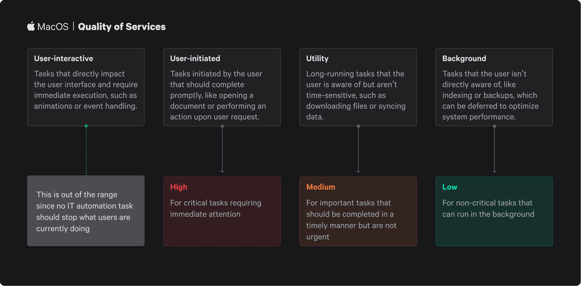
Simple overall, but MacOS forced design changes due to how its Quality of Service works.
UI decisions
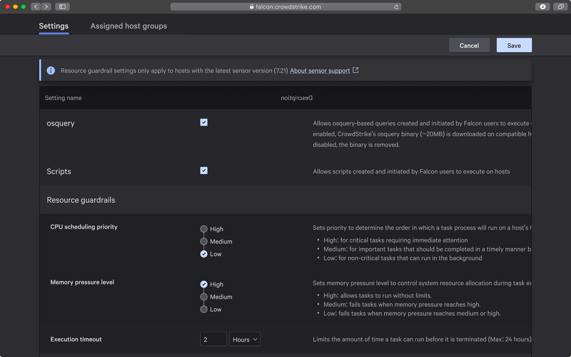
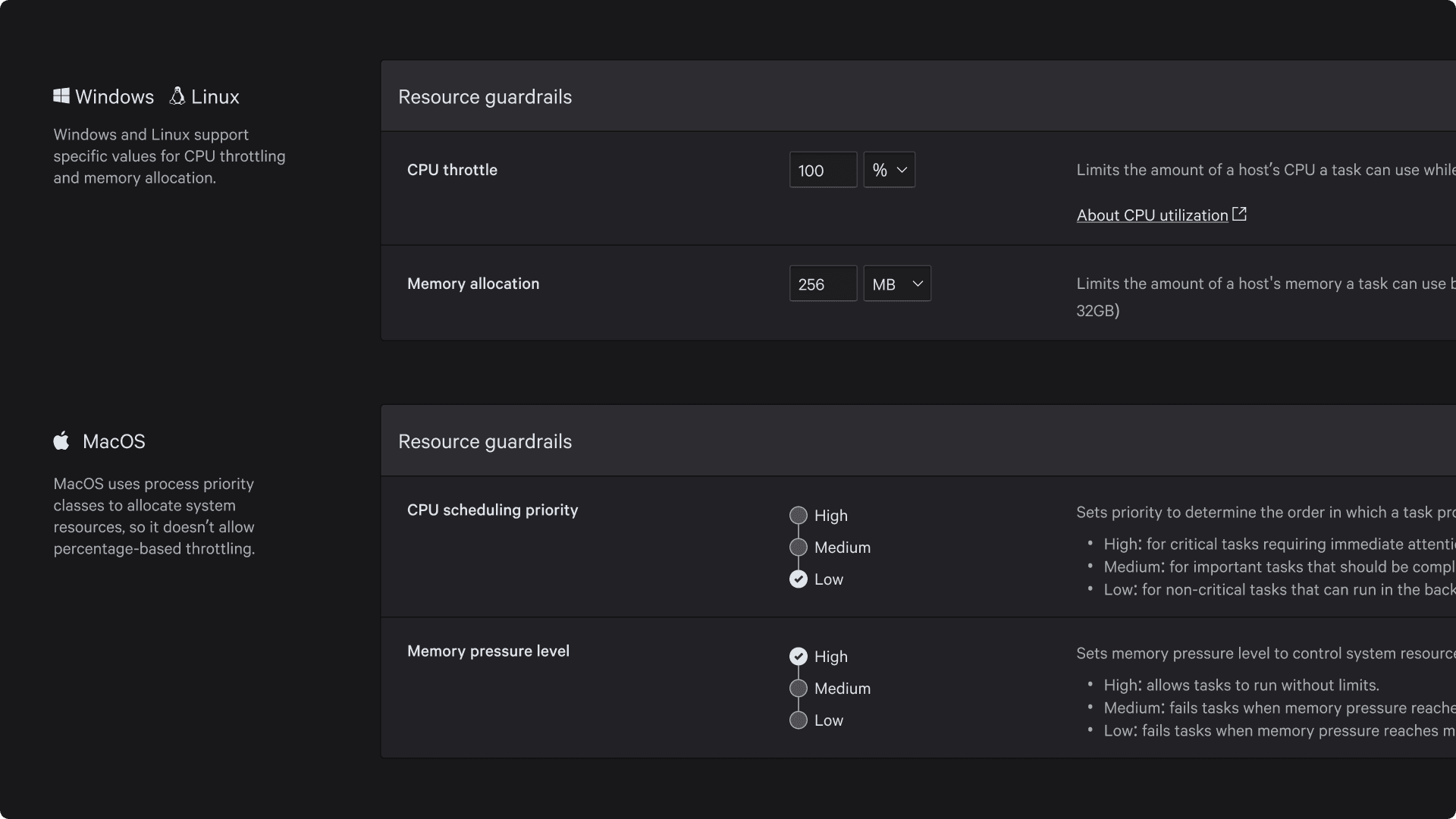
Mac couldn’t accept precise values, so it required radio button groups. Windows could support granular input.
Engineering pushback
They wanted radio buttons everywhere for simplicity.
I agreed it’s simpler, but this feature was for a specific client who explicitly wanted granular control. Inputs allow that (e.g., 1% restriction).
Still had to argue for it.
Results and final thoughts
Users happy = revenue = success.
This isn’t meant to be a “great” case study. It’s me:
- Shit-talking a bit about how tech companies actually work
- Showing what day-to-day design looks like
Thanks for reading. Hope you relate.