
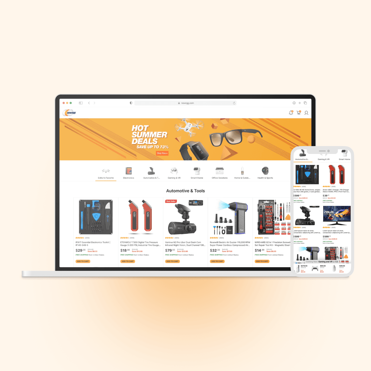
Improve engagement in weekly promotion campaigns
This project was a small experiment from my time at Newegg.com as a web designer. It was probably my first accidental UX project.
HTML / CSS / JavaScript
Context
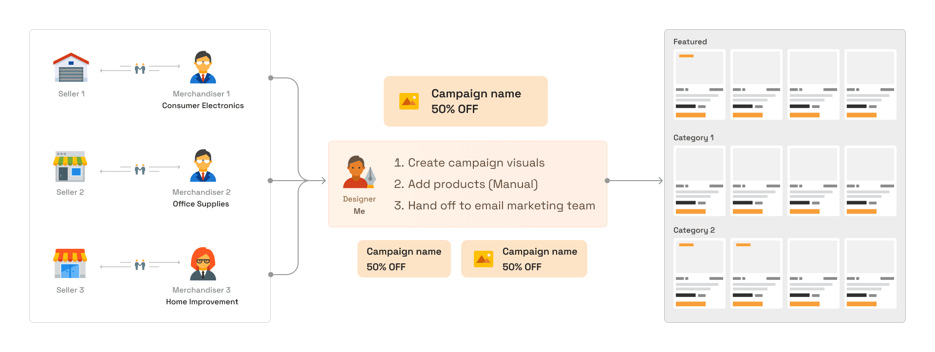
Newegg's marketplace team ran a weekly promotion email separate from the main corporate campaigns, which mostly focused on computers. Marketplace covered everything else: home improvement, outdoor, tools, and more.
How the campaign worked
- The marketplace team prepared the weekly campaign, and the designer manually placed the deals on the page.
- Create the emails and homepage hero banner for the campaign.
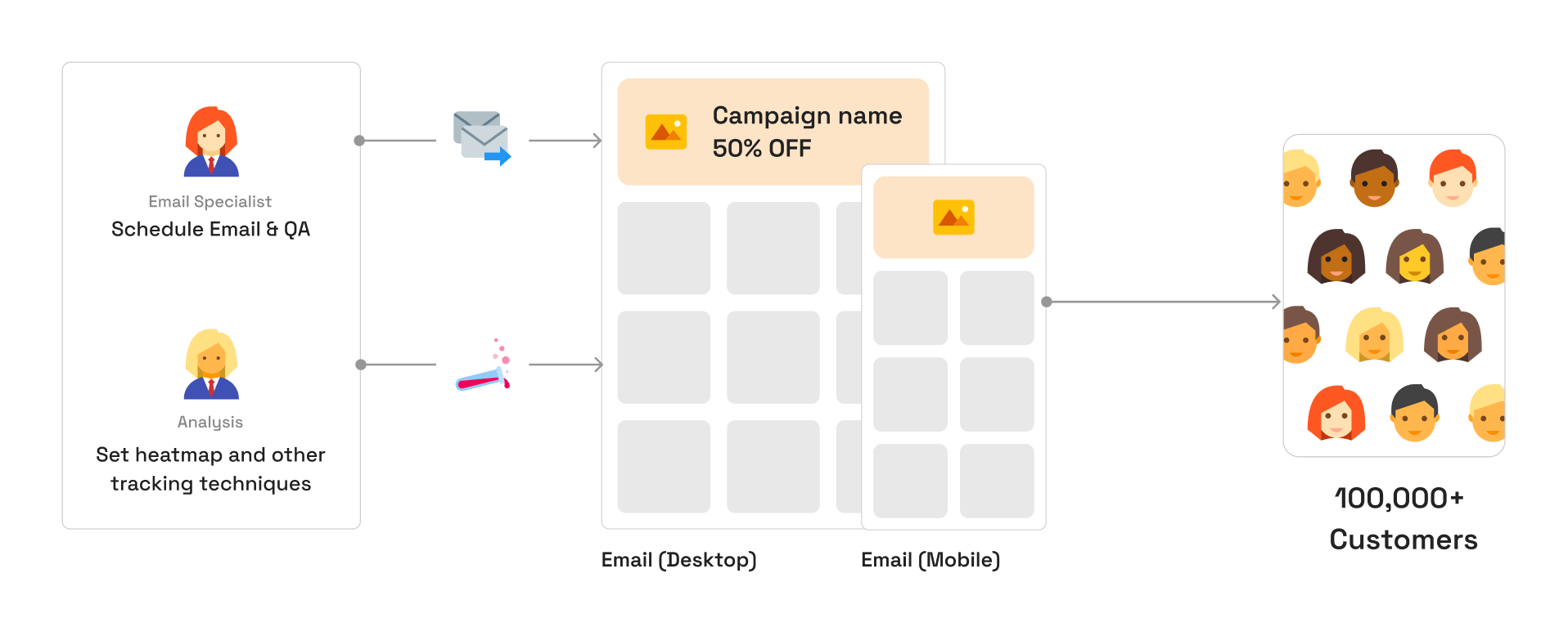
- Hand everything off to the marketing team for the rest.
The homepage banner drove the most traffic to the weekly promotion page.
Problem
The campaign page had a featured section with the best discounts of the week, but users often dropped off if they did not see the product they wanted there. That meant the rest of the page got very little activity.
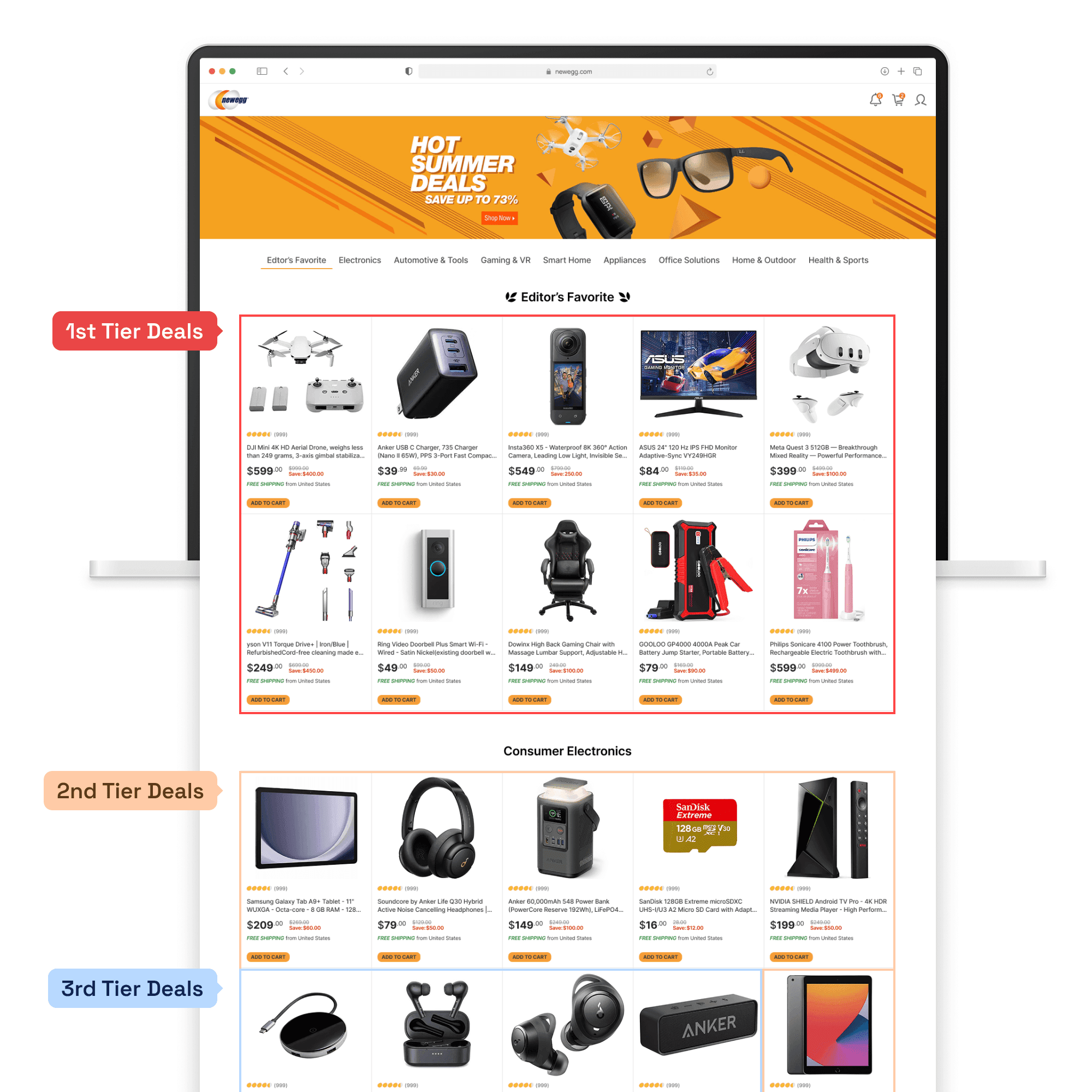
There were anchor links for each category at the top, but they were not strong enough to get users to explore other sections. And to add a little sadness here, each category was managed by a merchandiser who spent a week going back and forth with vendors to negotiate pricing. Even when the deals were not the strongest, they were still discounts.
Validating with the statistics
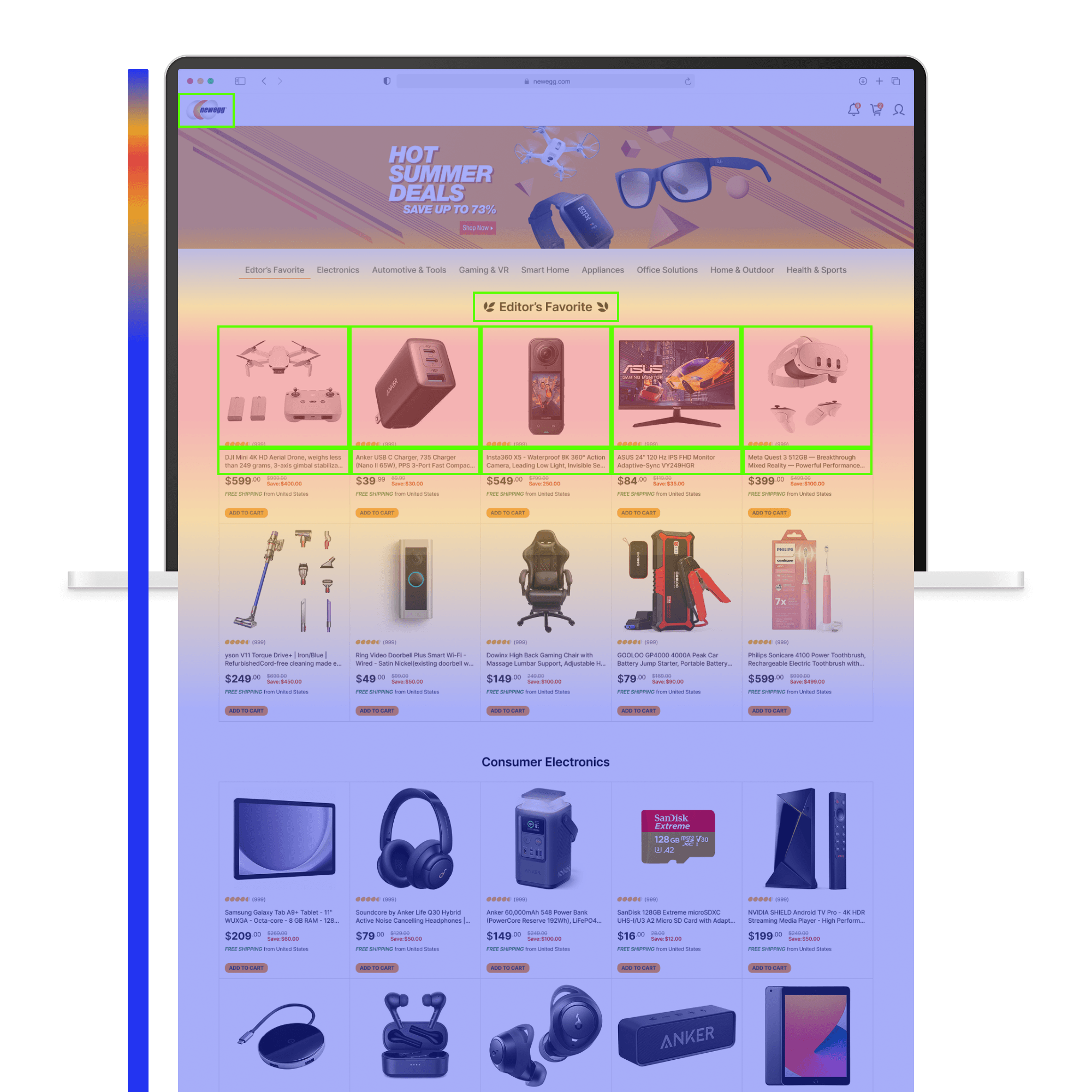
The heatmap showed that most activity stayed in the featured section. If users did not find what they wanted, they often clicked the logo and went back to the homepage. I could tell they were not finding what they wanted because another high-click area was the featured section title, which did not link anywhere.
Ideation #1
I used a bit of my front-end skill to modify the web template and add a category bar. Each item had a visual hook using an actual product thumbnail from that section. The selected thumbnail had to meet a few conditions:
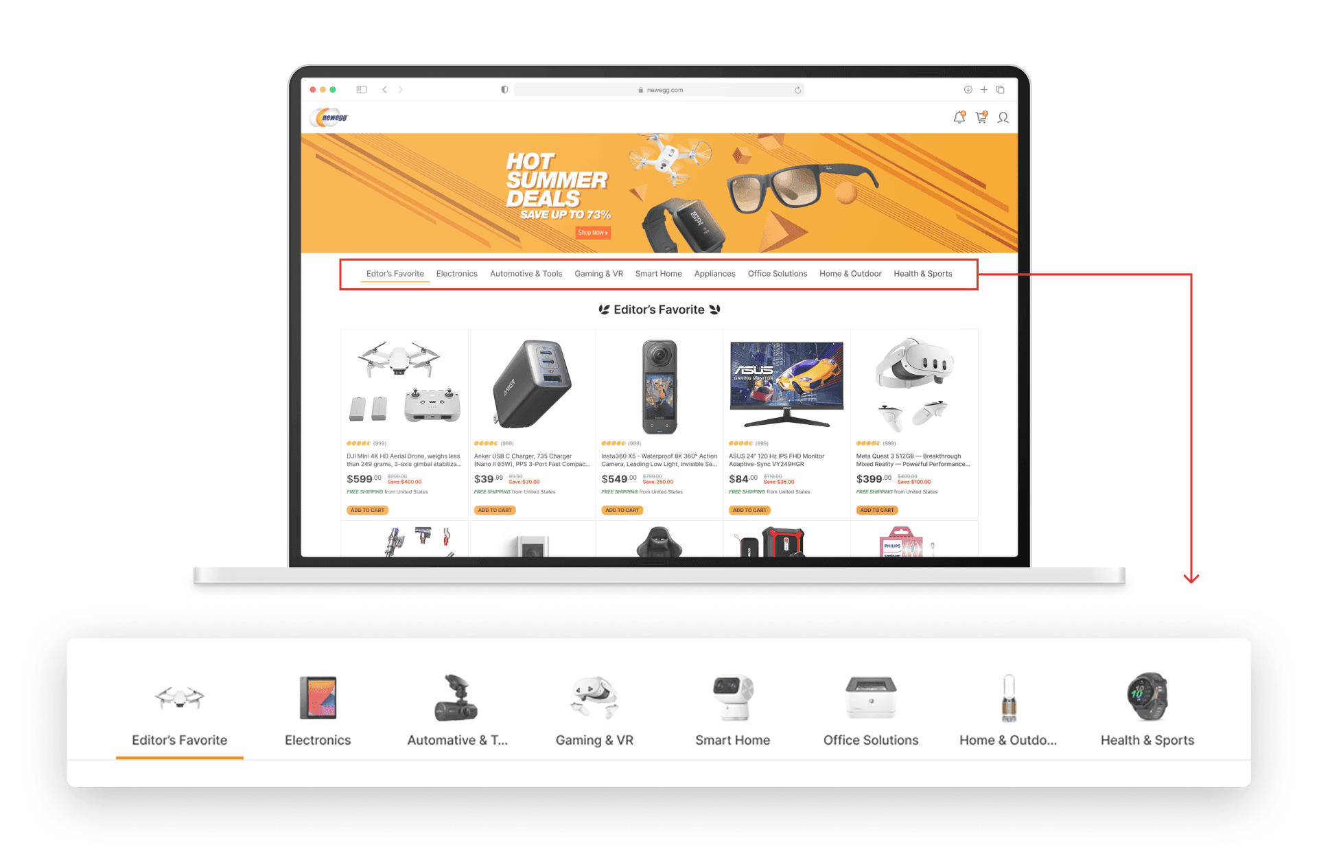
- The product image had to be easy to recognize at a small size.
- It did not need to be the best discount in the section, but it did need to be recognizable and popular. For example, choose an iPad over a less familiar tablet.
Interaction
As users scrolled, the category bar stayed pinned to the top with a scroll-spy feature.
Result
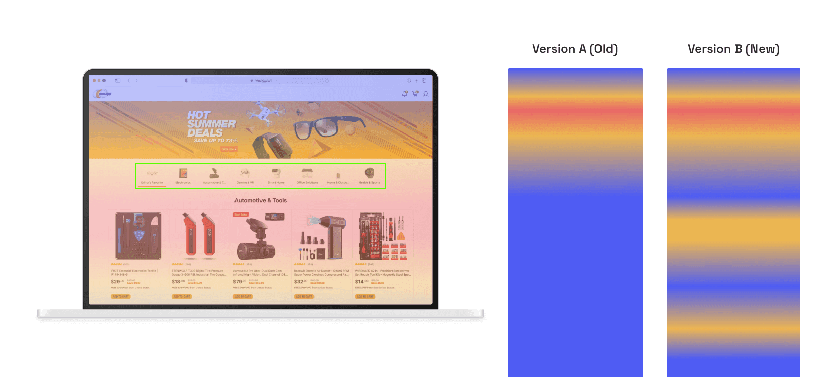
We started seeing users use the category bar to jump to the sections they cared about. I gave a lot of the credit to the thumbnails. The visual hooks did the work.
Ideation #2
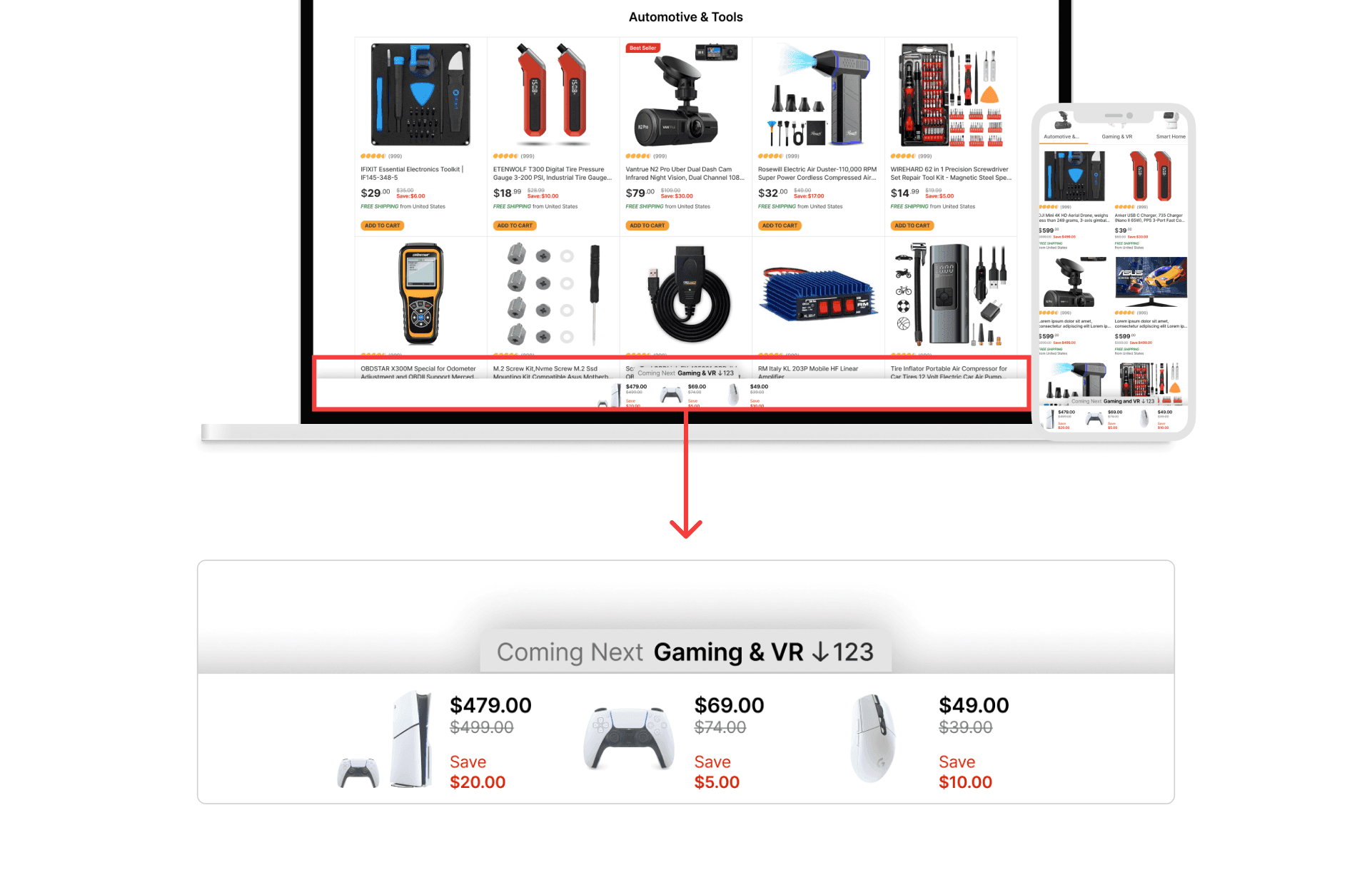
The second idea was a floating bar at the bottom. It acted like a preview of what was coming next. Depending on scroll direction, it showed 3 to 5 product thumbnails from the upcoming section. Each thumbnail displayed the original price and discount price.
Interaction
Clicking the category name jumped to that category. Clicking a product thumbnail went straight to the product detail page. The bar appeared after users scrolled past the category bar.
Conflict
I could not keep both the floating top bar and the bottom bar at the same time, so I turned off the floating category bar for that round of the campaign.
The heatmap also showed that the second idea was not much of a win, so I stuck with the first idea.
Final result
My memory is a little fuzzy, but I think idea #1 only improved things modestly. My rough estimate is that it increased scroll depth past the featured section by about 20%.