
Improving engagement a meditation app
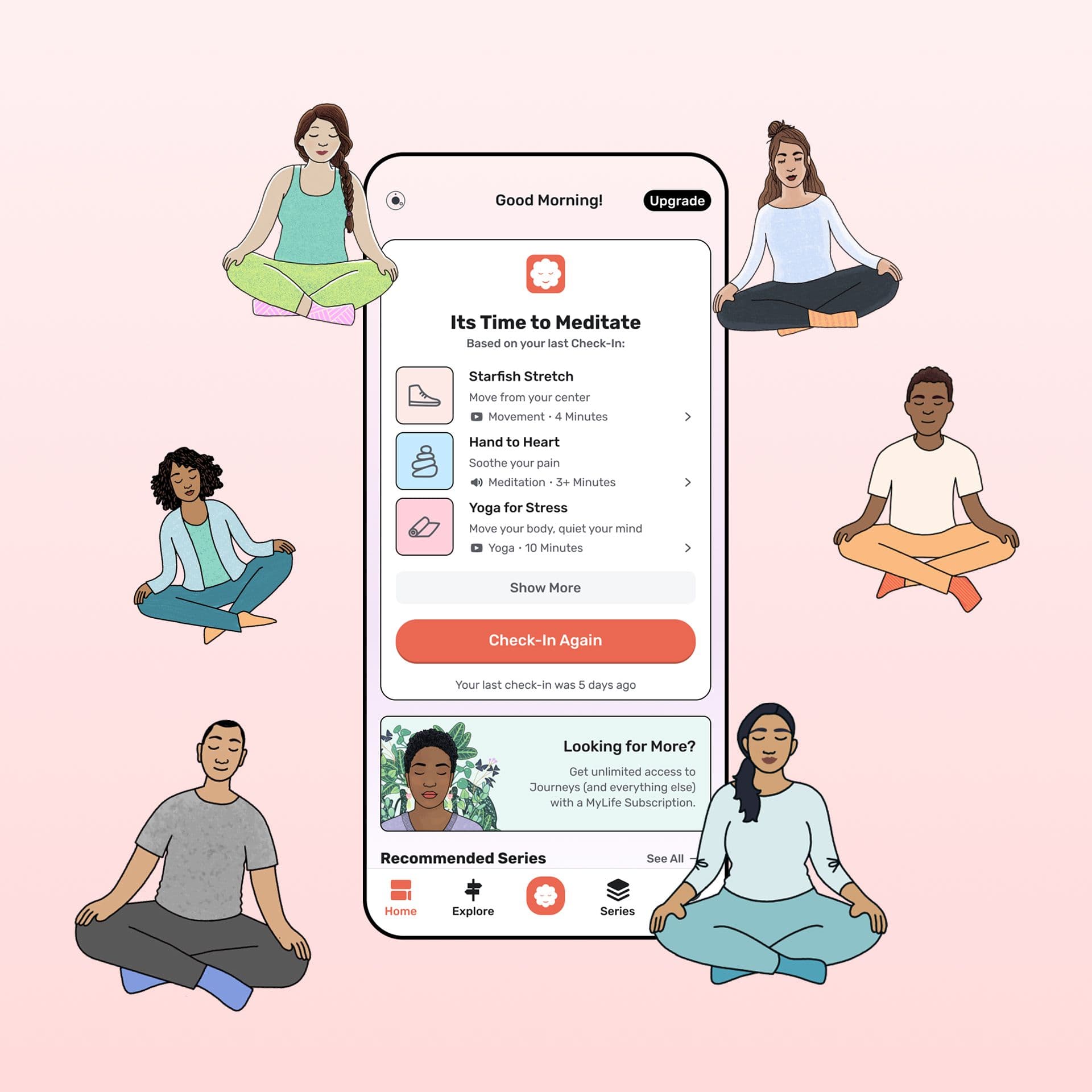
Redesigned onboarding, check-in, and activity flows to simplify meditation for new users, increasing conversions and boosted time spent in-app.
Figma / ProtoPie

Context
MyLife was a meditation app built by a small team of meditation professionals, iOS developers, and a product manager. The app had already launched an MVP and picked up users during the pandemic. Later, the company was acquired by the company I worked for.
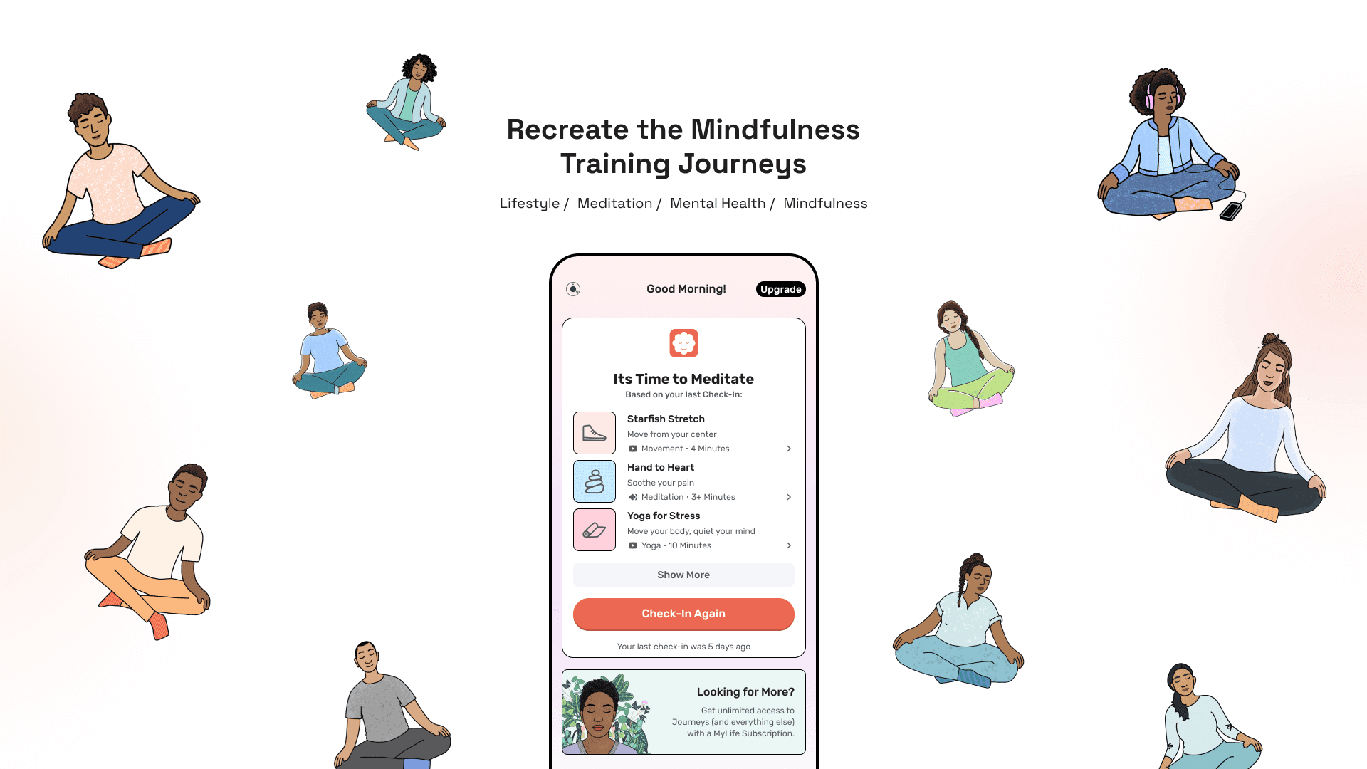
The original team only had an illustrator and an iOS developer, so I was brought in as the UI/UX designer to improve the app. We worked like a startup. There was no real process. We just designed things and tried to get them into production.
Research
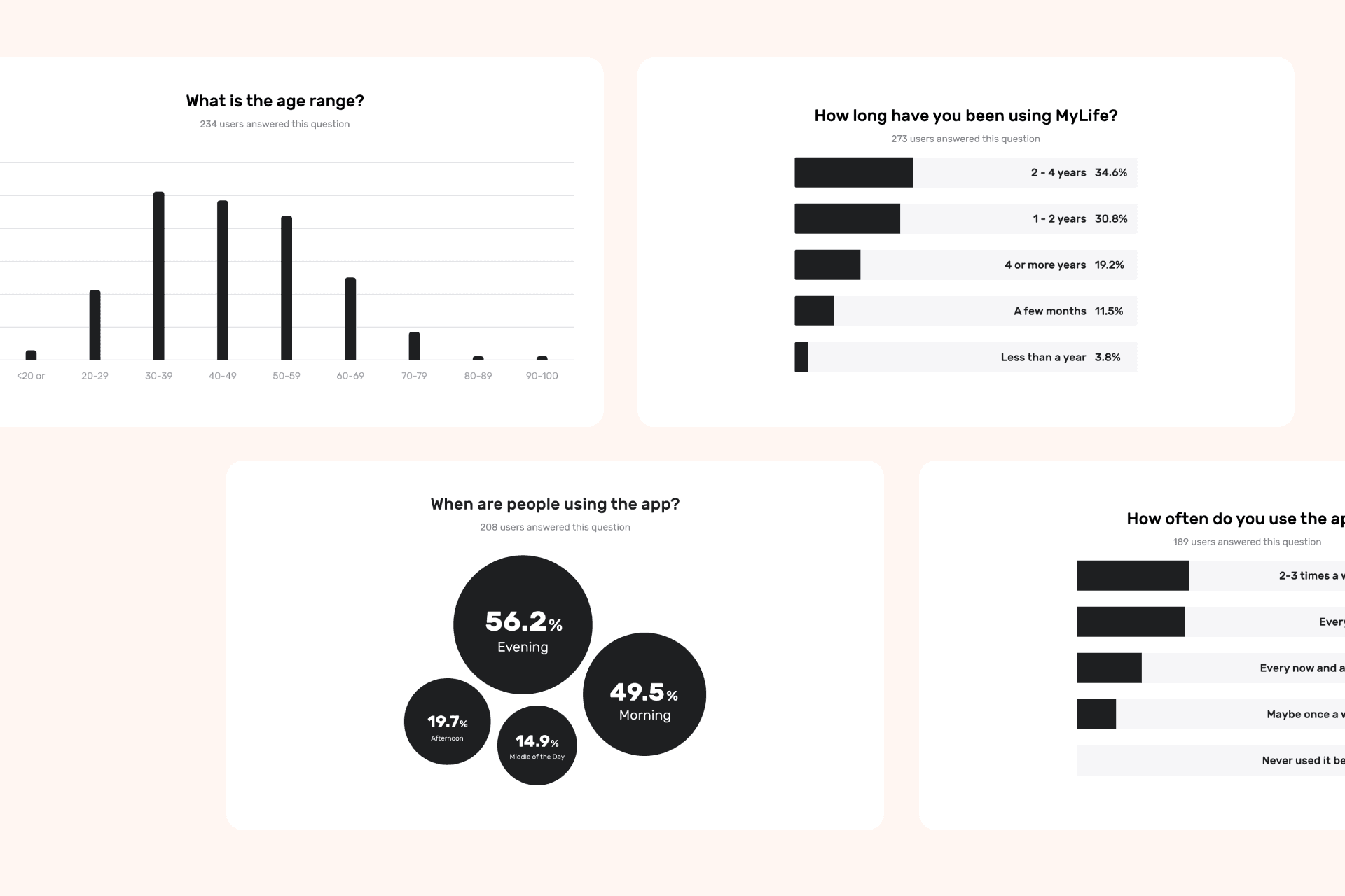
There was no budget to research the existing user base, which would have been the best way to understand what was not working in the app.
That is common at small companies. Research gets overlooked, while design gets pushed toward new features and nicer-looking UI. We had neither quantitative nor qualitative data, which made it harder to decide what to work on and why.
Thoughts on research
After working at a large tech company and interviewing with others, I realized a lot of so-called user research is just designers on Zoom or in a room, putting sticky notes on a whiteboard and discussing a few customer conversations.
The ugly truth is that only major initiatives at large companies usually get the funding for large-scale research. Unless you work at places like Google, Netflix, or Airbnb, where research may be more standardized, most projects do not get that level of support.
A lot of the time, there is no deep research. I asked about research methods in interviews, and I could tell some people were making up polished answers the same way I made up polished case study stories.
Usability testing and product metrics matter more
Usability testing is probably the best way to evaluate a product. When users understand the context and know what to do next, that usually points to good design.

The best approach is to work with a small sample of users and focus on their core needs. In this case, if a customer says, “I just want to feel calm right away,” that could lead to:
- Simplifying onboarding and the daily check-in flow, asking fewer questions, understanding the user’s mood quickly, and sending them straight to relevant meditation sessions.
- Asking permission to turn on iOS Do Not Disturb for 1 hour once meditation starts.
- Dimming the screen light.
The scope grows fast, and then the usual questions follow: why, and which one matters most? My answer: I do not know, but we probably need all of them to improve the experience.
Competitive Analysis
The 2 biggest meditation apps to learn from at the time were definitely:
- Calm
- Headspace
These apps either use calming landscape imagery with dark color palettes or simple, playful characters with animation. Our illustration style was different, but I still felt we could make it feel a little more alive.
They also did not have a complex daily check-in flow. Usually it was just 1 question to identify the user’s mood before starting meditation.
Their upsell flows were as annoying as everyone else’s, but at least they used lightweight overlays that were easy to dismiss. That part was worth copying.
Define the problems
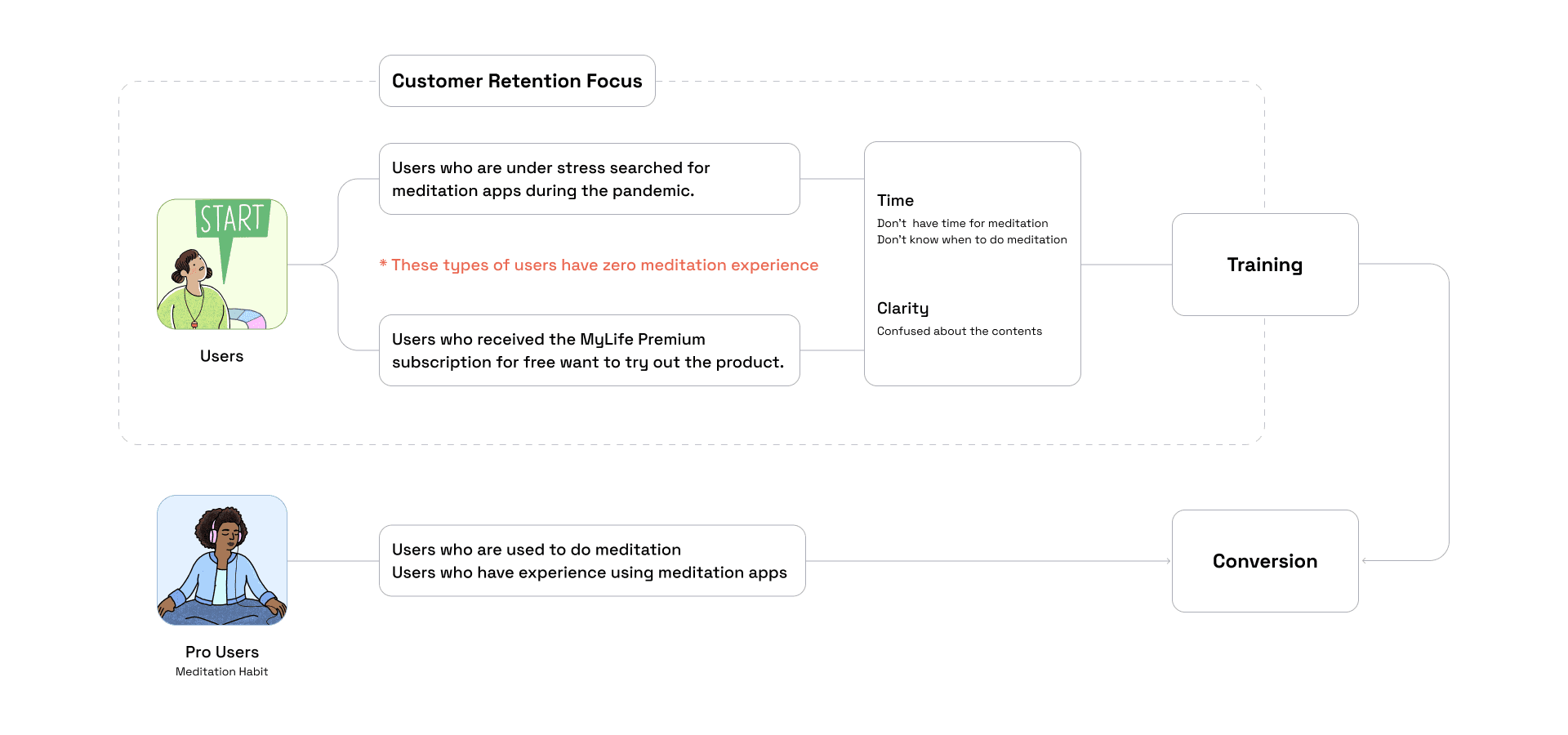
With no user data or research, I had to define the problems using my own judgment.
- It took too long to go from opening the app to starting a meditation.
- The home screen needed to guide users more directly to a meditation session.
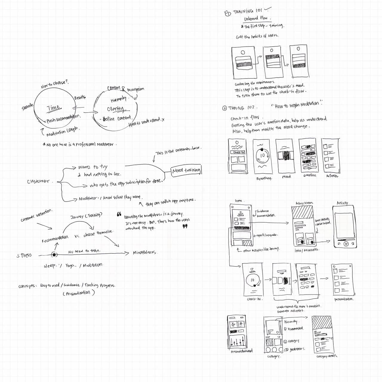
I believed improving this would support the business goal:
- Convert free users into paid users OR improve overall retention.
Ideation
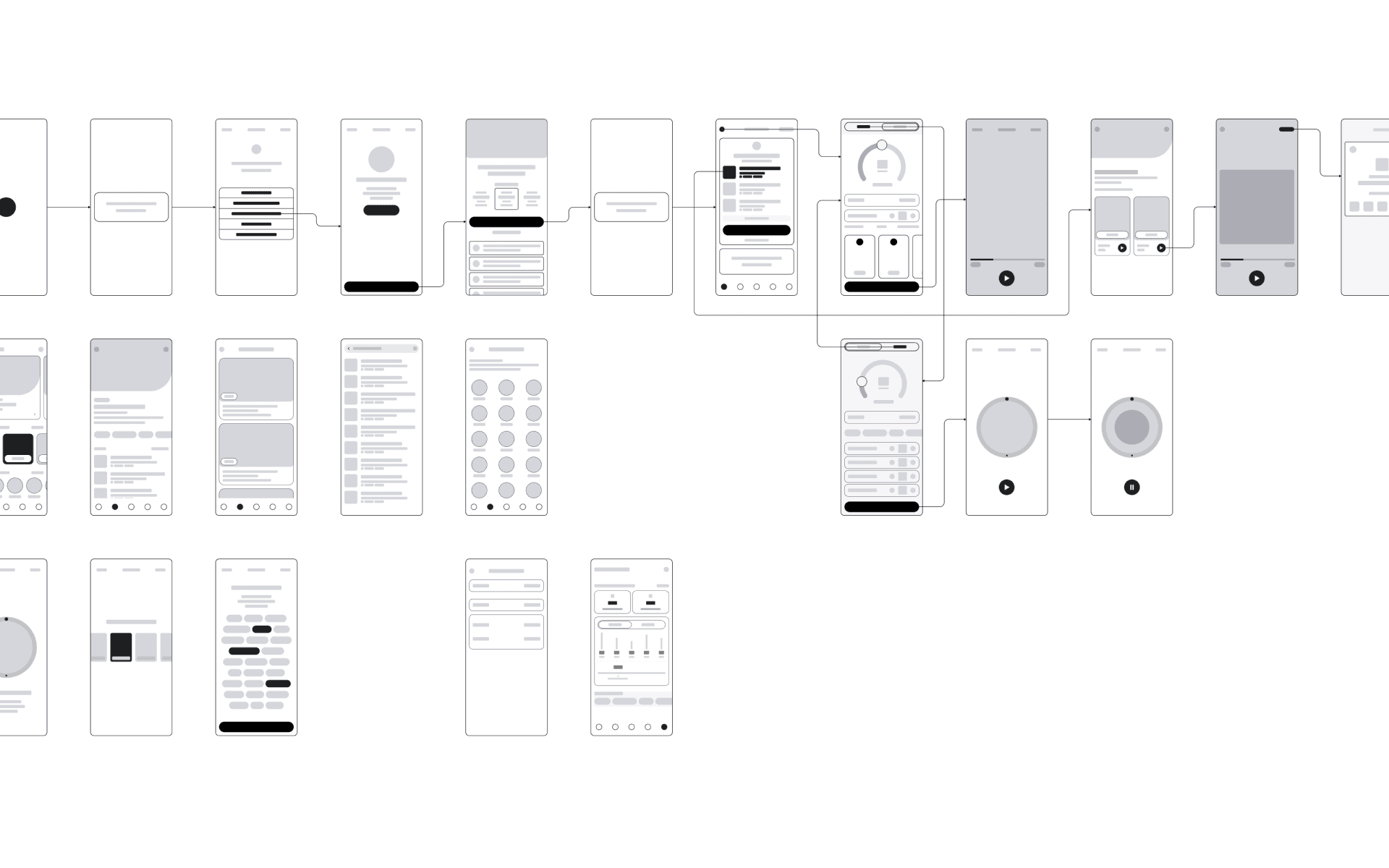
I had a few ideas for making the app clearer and helping users feel calm and guided.
- Animations
- Clear information hierarchy
- Micro interactions
Design System
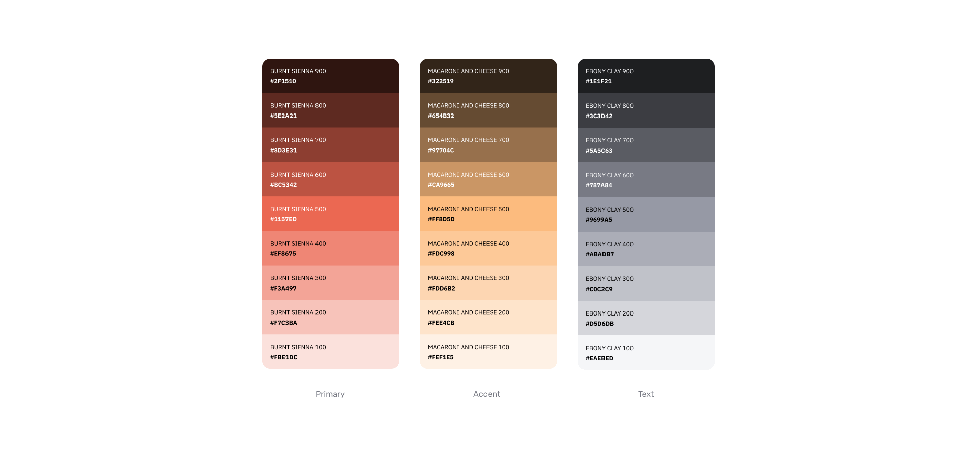
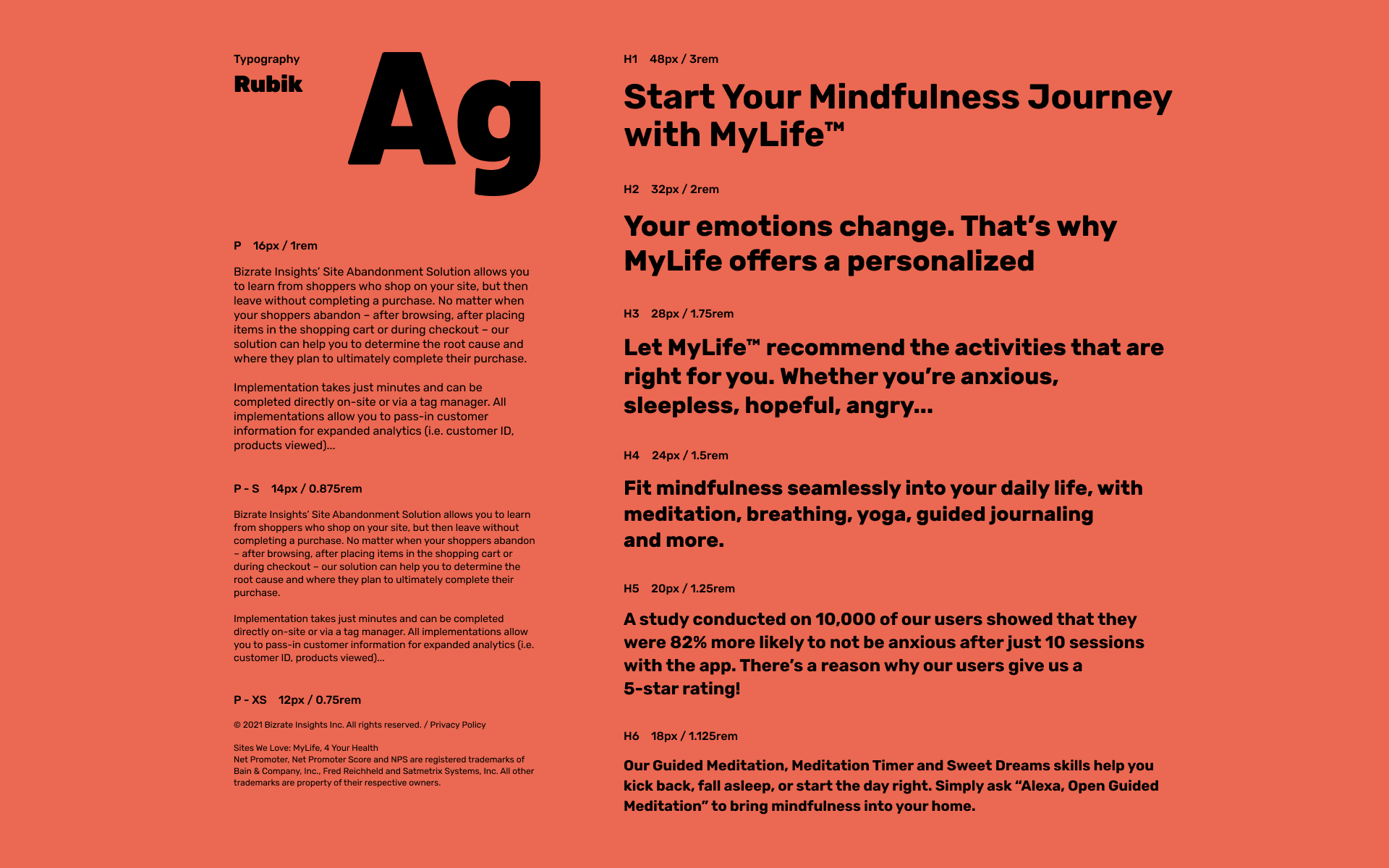
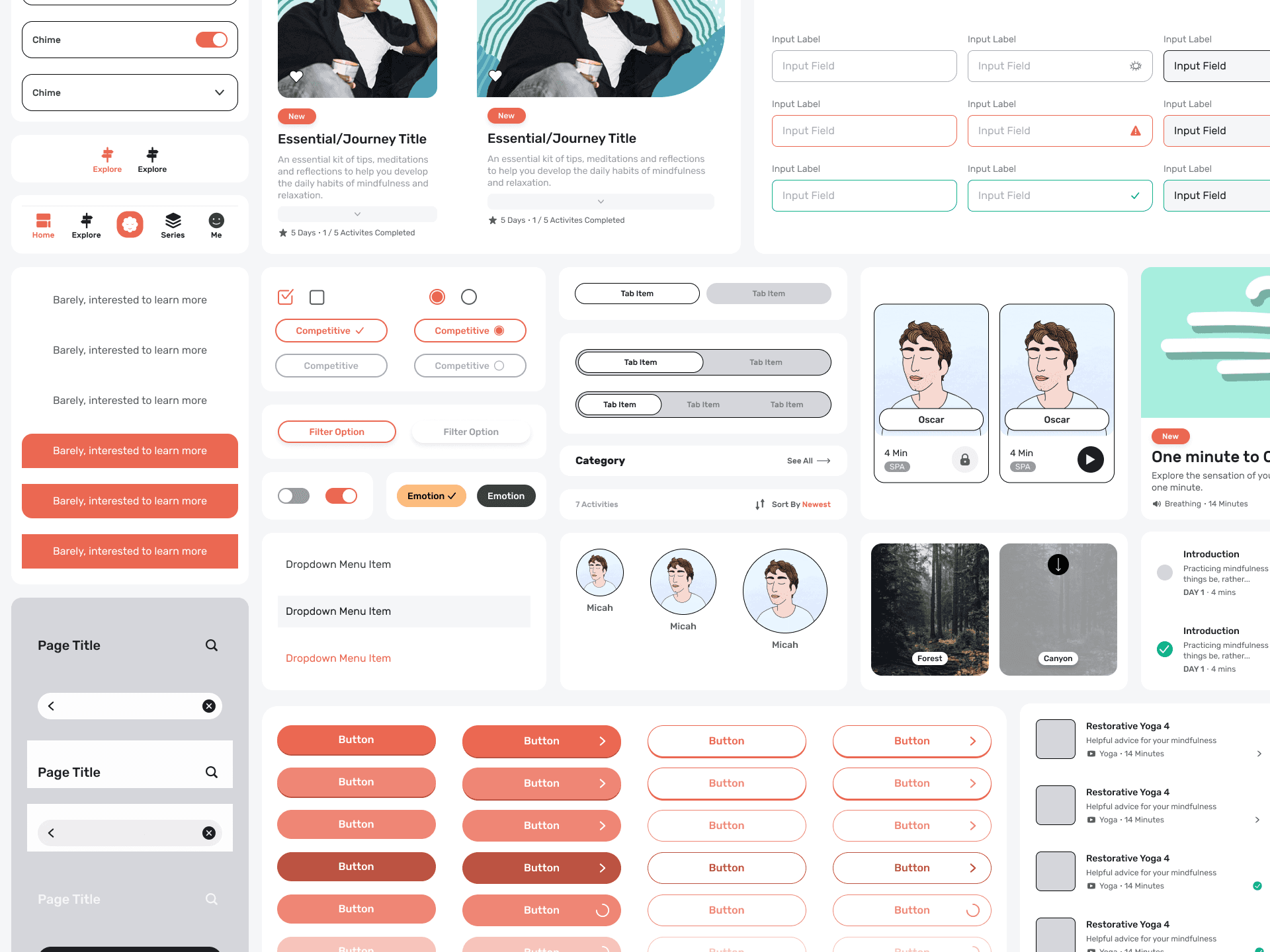
I drew wireframes to figure out which parts of the UI needed to be redesigned and which needed to be created from scratch. I also used the primary color to build the rest of the UI system.
Solutions
Shorter onboarding
The original onboarding was too long and unclear. Users had to go through a long series of questions. My instinct was that they probably understood the questions were trying to identify their goals or mood, but once it dragged on, it became tedious.
I redesigned the experience by adding an animated brand logo that worked like a breathing pattern and reduced the onboarding flow to 4 steps.
Simpler check-in
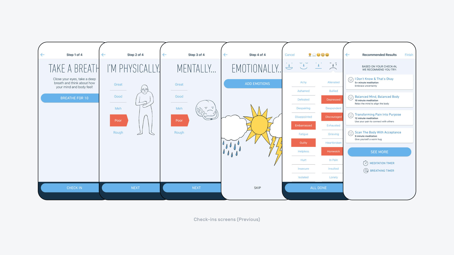
Check-in was another daily task that took too long. A better flow would let users log their mood and get started right away, but the existing experience had too many steps. I redesigned the daily check-in into 3 steps:
- Breathing activity
- General mood selection
- Emotion multi-selection
Better visual hierarchy
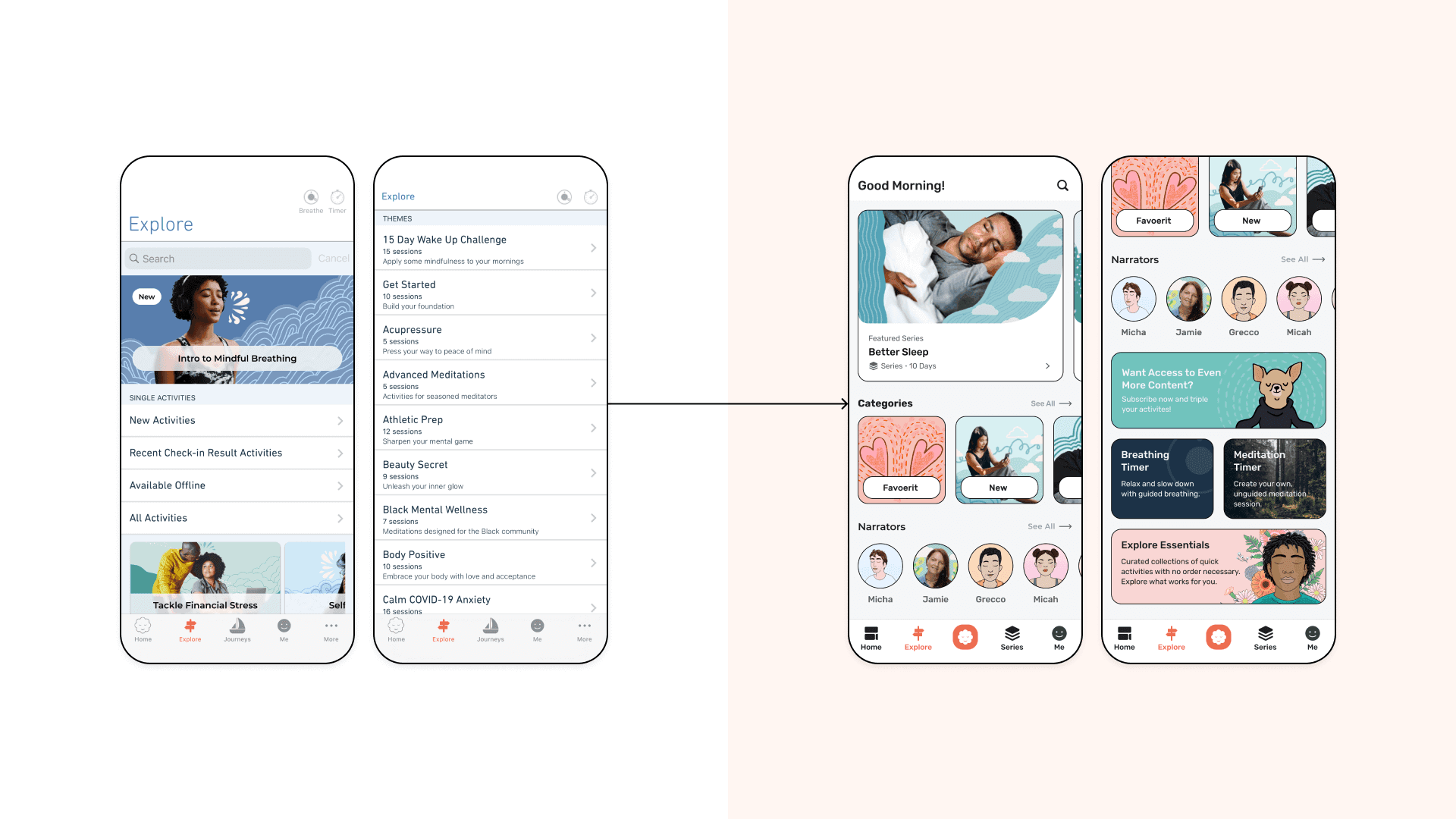
The old home screen was text-heavy, the information architecture was confusing, and the session names were hard for users to connect to their current mood.
I leaned more heavily on the branded illustrations and grouped content with different UI sizes and shapes to create better visual hierarchy. I also improved the wording.
Interactive reminder
This was one of the nice-to-have features I designed. Timing matters with meditation because sessions are often tied to a moment or mood. Adding this feature could also help increase notification opt-in rates.
Personally, I also just wanted to animate more of the brand style.
Fly-in upsell screen
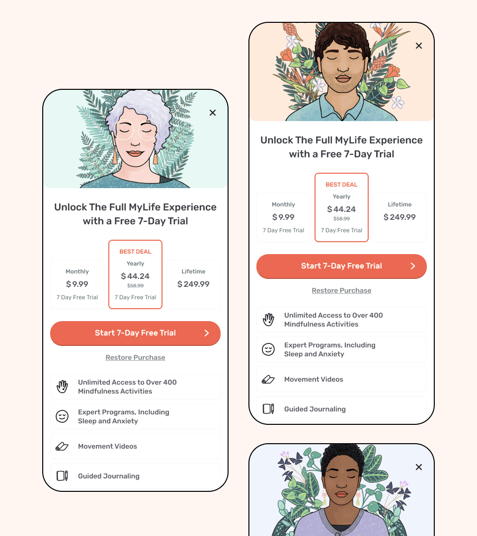
The old upsell screen was a static page that disrupted existing flows. I simplified it into a floating page that users could open and dismiss at any time without losing their place.
Meditation timer
This feature already existed, but I redesigned it to make the UI larger and more intuitive.
Outcome
Another disappointing case study that never made it to production, so there were no final results. Some screens were in development, like onboarding and the meditation timer. I will say the iOS developer I worked with was very good at capturing the designs accurately.
For me, the main takeaway was learning iOS design more deeply. It is not just about making nice UI. It is also about designing within system best practices and platform constraints.